In this post, we’ll demonstrate how Material Design began to impact mobile application development companies across the world. Read the guidelines on which the standards are based and how it differs from graphic design and material design. Finally, how to integrate material design into mobile applications.
Let me start a Material Design tour for you.
UI and UX are two mobile application elements that not only determine the application look and feel, but also define the current and future of a mobile application design company.
All proven techniques for improving the mobile app UI are focused on one aspect: mobile app design.
When you’re developing an Android app, its design is a factor that will affect its users mood.
The modern needs of mobile app users who are visually identifiable but appear to be the same as the actual elements can be difficult to translate into designs.
Mobile application developers can now help realize the material world of material design by creating and embedding interactive design elements.
The design world, previously dominated by minimum flatness, has now been replaced by the introduction of material design, minimizing interactive material elements.
Before we start to learn more about material design tips and tricks, let’s review our beginnings.
Review Google Material Design
When we understand the significance of design, we are known for being broken. And it’s not feasible to imagine the excellent design that Google didn’t offer today (even on iOS).
So how does this change happen?
This change is the result of Larry Page’s efforts to make things look and connect well after taking office.
This directive creates a design that is cherished by the world, the current Google creative design.
Material Design (codenamed “Quantum Paper”) is the largest part of Google I/O 2014 announced Android L release.
Design standards introduced four years ago now allow mobile application designers to inject their own palettes from applications, provide transitions, and bring new widgets and animations.
When designing an intuitive and appealing Android app, Google can continue to use Apple early, and is now ahead of the material design version.
Material Design demonstrates how to add technical elements and rules to design elements to create an app UI that provides a fun and interesting user experience.
Material design is by no means a graphic design. Go to the next part, Material Design and Graphic Design.
Differences in materials and graphic design
All the differences between the material design and graphic design are key.
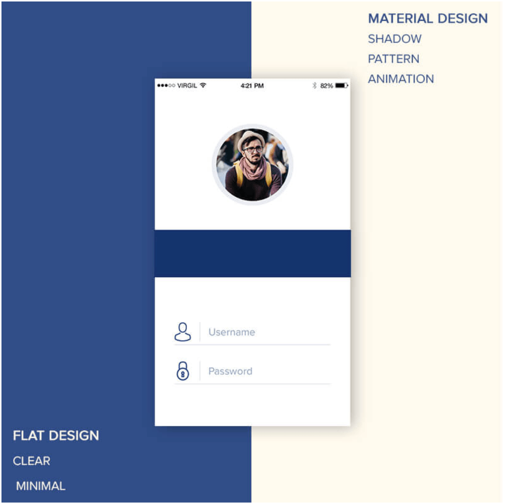
When you compare a graphic design application to a material design application, the biggest difference you can find is the presence of multiple dimensions in an aesthetic flatness. On the other hand, there is a lack of skeleton similarity.
Android creative design and graphic design are very small, but when implemented in Android application design, the selection between the two is usually based on your needs.
While complex design and powerful interactive mobile application development are more popular than the Material Design UI, when a mobile application design company has time issues with simple requirements and application development, the flat design UI is preferred.
Now that you’ve seen the basic difference between Material Design and Flat Design, let’s take a closer look at Material Design.
The principles of Material Design are
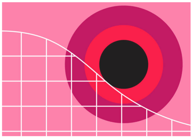
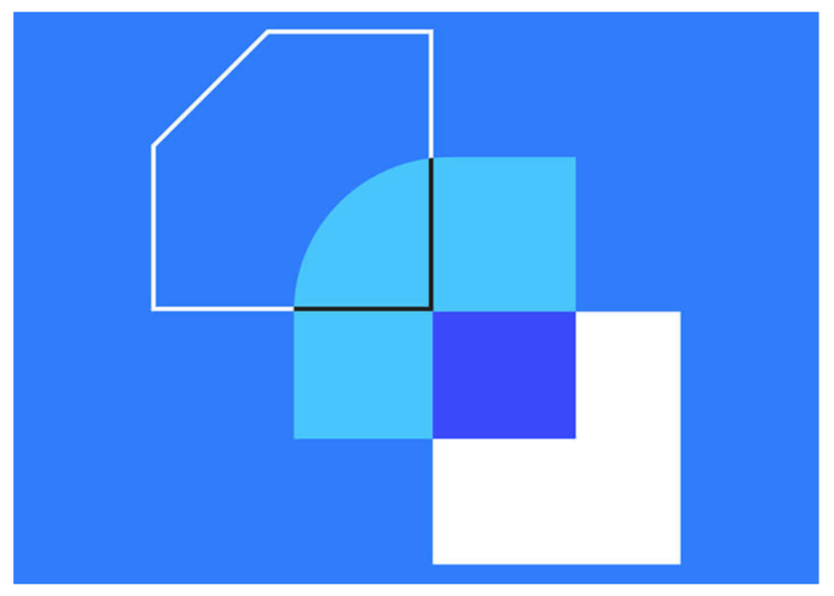
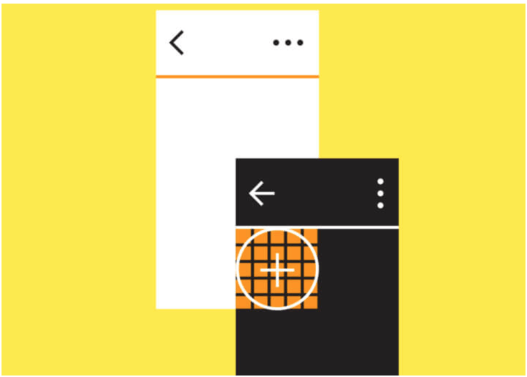
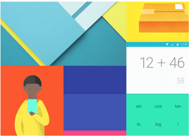
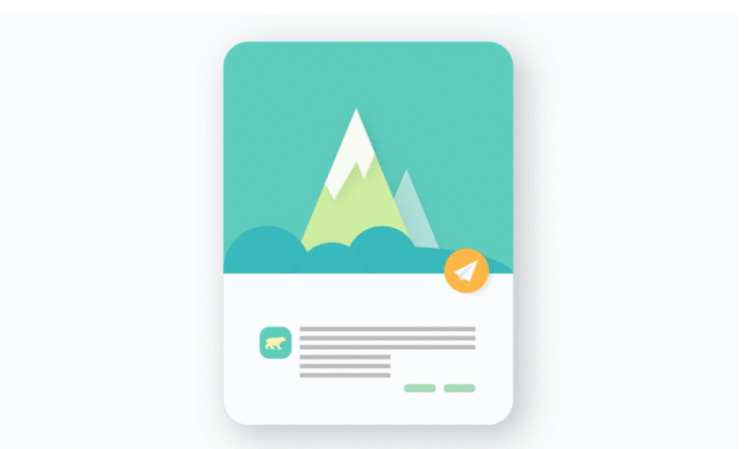
The Material Design application follows the three basic principles described in the image above.
Material is a metaphor
The principle of imagination is based on the study of materials and their different appearances in all aspects of light, and their appearance when superimposed on each other.
The principle is supported by attributes such as edges, shadows, and dimensions.
Bold, intentional, graphical
Intentional blanks in the design, bold but unsynchronized color sets, and direct use of a screen suitable for the screen define a second material design principle.
Meaning of consent
Animation in material design does not interfere with other design elements and does not seem to be mandatory. They appear in the results of the user’s default behavior and follow their clues.
These are the three basic principles of Google material design, but there are two principles that define flexible foundations and cross-platforms, which are globally, recognized design standards.
Flexible foundation
Material design provides the advantage of a custom code base that enables mobile app designers to add branding elements to their designs.
Cross-platform
Material Design helps maintain a constant UI across platforms, helping you use shared components on Android, Flutter, iOS and the Web.
Therefore, there are five basic principles for material design for Android applications. Now that you understand these principles, it’s time to look at how to apply it to your app UI.
How to create Google creative design in Android apps
If you have read the official design materials that Google publishes, apply it to your mobile app.
The following information will help you master the material design in your application and become the design star of a mobile application design company.
Use the shadow to display the hierarchy
Edges, surfaces, and realistic shadows are considered key tools in the Material Design UI. Shadows are used to display the hierarchy of design aspects to show which elements are what.
Bold colors
Bold graphics are the mantras of materials related to mobile UI/UX design. Bold colors make the user interactive and fun to use.
Use default colors and highlight colors
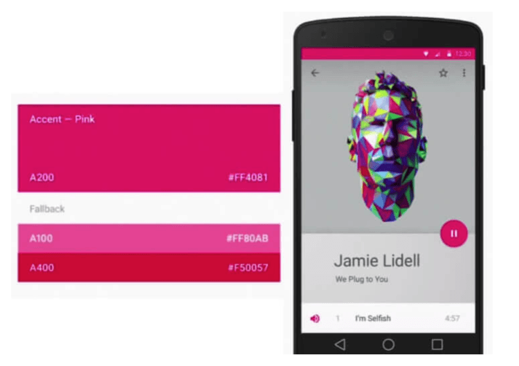
The Google Materials documentation requires mobile designers to make use of three shades, one for the primary color and one for the highlighted color.
The default color set is used for the fonts and backgrounds, and can be populated with accent colors to show the main elements of the mobile app’s screen.
Extract color from the image
As mobile application designers develop image-based designs, we continue to encourage them to extract colors from images and make use of them as color palettes.
Motion integration
We are very interested in using actions in app UI design. This way, we can understand how content moves and how users interact with the app.
Let everything floats
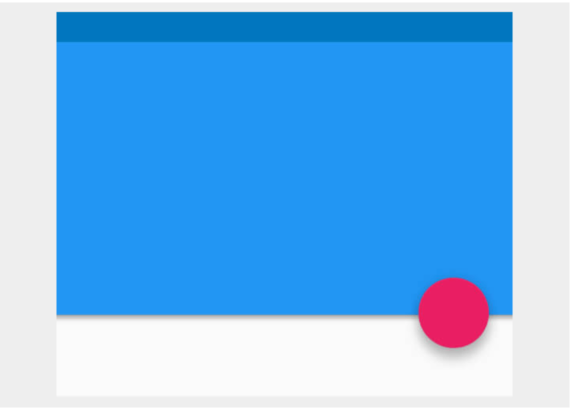
If you have a USP, a visible material design application is a floating design element. The button or CTA bar of the application should appear to float on the screen and should not be placed flat on the screen.
Select icon
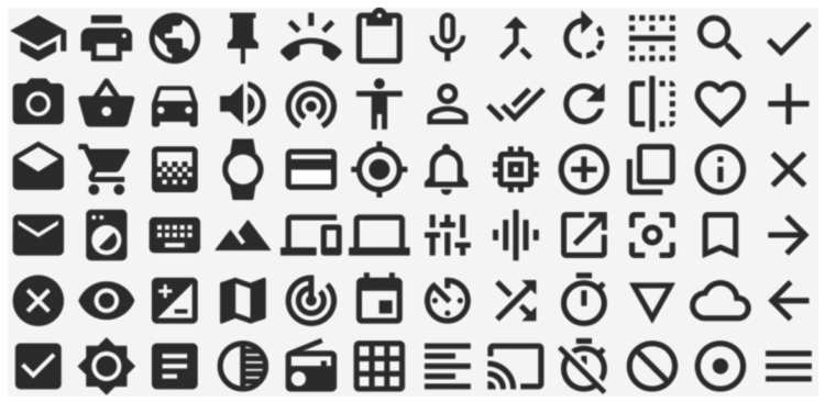
Choosing the right icon can increase the usability and design of your app. Now you can choose from several icons, which fall into two broad categories.
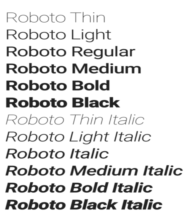
Make the app suitable for printouts
If you start with the basic idea of creating a material design application, you should stick to the Roboto and Noto typographic styles.
Reflection on design response
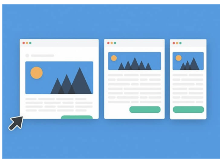
One of the important guiding principles of material prosperity is consistency. You should see the same content in your app design.
All design elements must have the same functionality on all devices that the users interact with.
While these nine scratches will help your current application, the design criteria will be redefined as a new creative design version prepared by the Google Creative Labs workshop.
What is the next step in Android Material Design?
After changing the design world standard using the Material Design Guide, we changed the structure again using Material Design 2.0.
The 2nd-generation material design will survive in the next few days, with a rectangular interface for bidding and a turn-to-round mobile UI design.
With the new Creative Design Application Guide, we plan to improve all important products like Gmail, Google Search and Google Maps.
Material Design 2.0 – The goal of Material Design 2.0 is to improve efficiency, readability and eliminate confusion, making the UI the cleanest UI to date.
Therefore, the Android material design guide has stepped into the Android application design world of Android application designers and Android application development companies. At Octal IT Solution, we have huge experience in mobile app designing and development, so that can benefit you immensely. Contact the Mobile UI / UX Designer team today to get your app ready to make the best creative apps. You can reach them at the following email.


