Silke is Marketing Manager at App Radar. When not writing about app marketing, you can find her looking for new places to explore or watching series with a cup of tea and chocolate.

This article was first published on App Radar blog.
Many developers decide to have their apps in both, Apple App Stores and Google Play. This is a great idea! However, to optimize your app perfectly in both stores it is crucial to understand that there are differences. Many things that are really important for Google Play, are not even considered by the Apple App Store. That being said, you need to know about these differences in order to optimize the best way in each app store.
Keywords and the App Store Algorithm
To do App Store Optimization efficiently, it is crucial to understand the algorithm used by each app store. Even though the algorithm, classifying and ranking apps is not public, you will see that some tricks in the Google Play Store won’t work in the Apple App Store. Let’s have a look at the most relevant difference: The App Store Algorithm.
Keywords play an important role in both stores, but the way they are read is different. Both take into consideration the app developer’s name and the app title when showing the search results for specific users. Other elements vary either in weighting or are specific for one of the stores.
The algorithm of both the stores is also influenced by the total number of downloads and the number of downloads in a short period. To classify the app, the algorithms combine and scramble keywords present in your app listing.
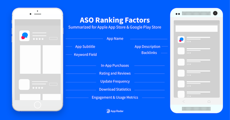
SEE ALSO: ASO Ranking Factors for Apple App Store and Google Play Store » Learn about App Store Optimization in our ASO Guide
Tweaking Google Play’s search ranking algorithm for Android ASO
Before starting ASO for your Android app, it is important to understand that Google Play’s algorithm takes almost every textual element into consideration for keyword indexing. The most relevant keywords come from the app title (50 characters), short (80 characters) and full descriptions of your app (4000 characters). Regarding the full description, use your target keywords a few times, especially on the top and bottom lines. Other elements like the developer name, URL and package name also influence your keyword rankings. Nowadays the developer’s history started to count too, meaning that developers with a positive history and a high position in search take advantage over others.
ASO Tip: In order to get a keyword indexed, it needs to be included between two to five times in the Google Play description or once in the App Title or Short Description.
Latest changes include the influence of app engagement for app games. That means it isn’t about the install only anymore, but the frequency of using the app. Apart from that, rating is taken into consideration, so answer your reviews and also ask users for it.
Google started to pay more attention to the user experience in 2017. The algorithm is now considering apps with the best performance, lowest number of crashes and stability. So, promoting your app is important, but do not forget about the user experience you are actually developing.
Looking behind Apple App Store’s search algorithm for iOS ASO
ASO for iOS is considerably different from Google Play. While Google is relatively flexible in finding keywords, Apple provides a specific field to write your keywords. Sometimes Apple App Store’s ranking algorithm gets keywords from your competitors and the category name. Apart from that, it is believed that Apple’s algorithm takes into consideration apps that produce higher revenues.
The app name, one of the most important fields for the algorithm, was shortened to 30 characters back in fall 2017. The good news is that Apple added the subtitle field, which is also considered in the app indexing and it can be 30 characters long.
In contrast to Google Play, at Apple App Store, it is advisable not to repeat keywords in the title and in the keyword section due to field limitations. Also, misspelling words and repeating the word in the singular and in the plural forms is not a good strategy.
ASO Tip: When thinking of long tail keywords, use the separate words in the keyword field to save valuable space and to keep the option to combine keywords.
In-App Purchases can appear in the app search, meaning that you must work on your keywords because, obviously, they are also indexing your product.
App Radar helps you tracking the performance of your app in search results for chosen keywords. It gives you suggestions of keywords and also displays keyword search traffic based on SearchAds. Click here to find out more about App Radar’s features.
How your app is displayed to the user
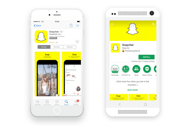
Both leading app stores, the Apple App Store and Google Play Store, show different layouts, effecting, how users make app install decisions. They more or less regularly adapt their interfaces and usability. Apple for example, just released a redesigned version of the App Store in 2017 after an adjustment in usability and design was long awaited by users and app marketers.
But let’s have a look in more detail.
Search Results
ASO for Google Play or iOS is about being easily findable at the search results, so you must know what your user is going to see before getting to your app page. Both, the Google Play Store and App Store, display the following app information in search results:
- The app title
- An app’s icon
- The developer name
- The average star-rating of an app *
ASO Tip: Since the release of iOS 11, iTunes Connect allows you to keep ratings, you have already received for previous app versions.
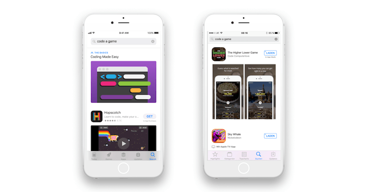
With the release of iOS 11, the search result shows three instead of two vertical screenshots. Also, app preview videos are about to be displayed to the users immediately within the search results. Even though you have more screenshots to show, the app frame has shrunk, meaning that almost two entire apps are shown on one screen of the app search.
ASO Tip: Make your first three screenshots show the most important features and get sure one can identify this features even on a small screen.
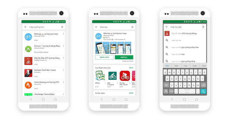
While everyone was excited about the new App Store, Google Play made some layout changes too. In the beginning of 2017 they have been experimenting with different search result layouts. These these experiments resulted in three different layout options.
In concrete, that means, if the search phrase matches the brand name of a specific app, Google Play gives you a more detailed preview of the best match. Thus, not only app title, icon, developer name and the average rating are shown in this listing, but the number of reviews and downloads, content rating as well as screenshots and the preview video (if available).
ASO Tip: Make sure you have your brand name clearly included in the app title to ensure, your app is shown in this layout. Also, make your screenshots appealing and recognizable even when they are displayed in a very small size.
Moreover, if Google Play thinks, you are searching for a very specific app, it shows the app icon and full title even directly within the search suggestions while you are typing. (Layout Option 3 will most likely influence the number of app page visits since clicking the search option with the icon will bring the user directly onto the specific app page.)
App Page / Store Listings
Both Google shows the average of your rating, Apple shows a total average rating and all-time stars count (instead of current app version rating only).
ASO Tip: This is good and bad news for all iOS devs. If your app already shows a positive rating, this is fine and you finally won’t have to start all over again after an update. If you still lack of ratings and reviews, you should get active by now since the rating will become an essential selling point with the new layout.
Let’s come to the possibilities of customizing an app page with visuals. These might not influence ASO straight, but it will definitely influence the conversion rate.
Google allows up to 8 screenshots per localization and one preview video. Plus, it asks for a feature graphic banner, which is shown above the app title and icon or at any featuring spot in the Play Store, if the app is featured. The video comes straight from YouTube and its thumbnail will be used as the feature graphic. At Google Play, it is also possible to make your app even more catchy by using emojis. Google shows the number of downloads of your app.
Apple allows a customized background of up to 5 screenshots and three videos of 30 seconds each. An optional text is possible. If the user already has your app this goes to the top of your app page, but if it is a fresh new user, it comes right after the video or screenshots. Your position rank within your category is shown next to the age rating.
Find out more about app pages and app listings in our App Store Optimization Guide.
App Updates
Unfortunately, to make changes in everything, apart from your description, what’s new text and URLs, you will need to be approved by Apple. However, at Google you can submit changes immediately. To make the process of publishing in both stores easier, App Radar launched the App Radar Publisher. It helps you to go over the publishing process in both stores faster, easier and more organized.
Different app platforms – different audience
Both mobile stores seek for bringing high-quality mobile apps and games to the right users. But in the end, both serve two – in some points very different – audiences.
What fits for both user bases, visual elements attract the most. Google Play’s users, however, decide more quickly than Apple’s users do. Android phone owners take their download decisions based on feature graphics, icon, rating and the short description, which means they interact less with the page than iOS users, who even scroll to check all your screenshots. In general, it can be said, that users in the Apple App Store are more likely to catch up on the app with the help of various app page elements.
ASO Tip: It is important to know where you to put your efforts to attract your potential user. Thus, A/B testing your app page is recommendable. Here you can find out more about how app A/B testing works.
Due to the huge offer of free apps, users of Android users are less likely to download a paid app. This fact makes it even harder to profit with an app offered for Android. It is easier to achieve direct sales via Apple App Store, even though, both stores get 30% of sales.
Conclusion
Both stores have their advantages and disadvantages when it comes to offering your app. Together, they count the largest number of apps just as well as the largest user base. Within this article, you now have all the necessary information you should know to succeed in the ASO of each store.

