You’ll find “increase user retention” on every app’s marketing plan, and there’s a good reason for that. While launch plans often focus on the number of downloads, for a sustainable business you need those users to stick around. A low (or falling) user retention rate is an early warning sign that something has to change if you’re to make it in the long term. Keeping the retention rate high it’s not easy, especially because 1/3 of users churn after Day 1 on average.
So how do you figure out your retention rate, and more importantly, improve it? Here’s our five-step plan to help you get started.
Increasing mobile app user retention – your five-step plan
Review your mobile app data
Set up your KPIs and measure your key metrics from day one. It’s fundamental to identify key drop-off points so you can fix your UI/UX accordingly. The formula for calculating your app retention rate is simple:
App retention = number of [time period] active users / number of [time period] installs
30-day retention is a good place to start. From there, you can compare other time periods (say, 1 day and 7 days after installation), and begin to work out when users typically begin to drop off.
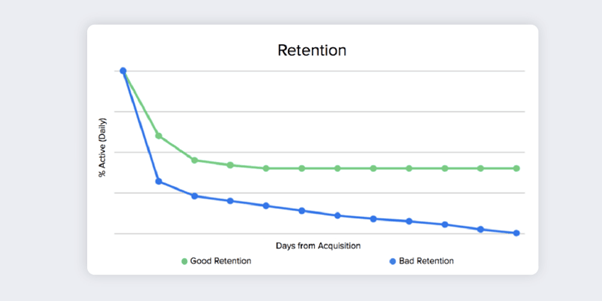
Inevitably, you will experience customer churn, and your retention curve will look like a version of this:
Source: CleverTap
While the worst case scenario is that your retained users dwindle down to zero, a more common outcome is that a majority will stop using it, while a smaller portion will continue for the long term. The sooner you can stop that line from falling and see it stabilise along the X-axis, the better.
An effective product analytics tool will help you find that crucial moment, so you can examine what behaviour or event triggered these users to stick around – it’s been dubbed the “Aha moment”, because it’s the moment that users suddenly realise the value of your app. From there, you can change your UI/UX to bring that moment forward, increasing user retention as a result.
Andrew Chen comments “The best way to bend the retention curve is to target the first few days of usage, and in particular the first visit. That way, users set themselves up for success”. It’s a strategy Yodel Mobile has often adopted with clients seeing a large drop-off between day 1 and 7 of use. Uncover the value of your app as early as possible, and you stand the best possible chance of retaining your users.
Understand your users
Cohort analysis (simply looking at a group of people over time) takes you deeper into understanding your user retention. It’s a chance to formally analyse the number of users still active over a given period of time, and map their behaviour alongside key events along the way.
Your cohorts will share a common feature, whether that’s the time at which they started using your app (acquisition-based cohort analysis) or an action taken, such as responding to a Push Notification (behaviour-based cohort analysis).
Context-aware tech: The secret to 81% more conversions
Learn how leading apps are using context-aware technology to deliver perfectly-timed offers, reduce churn & transform passive users into loyal fans.
Learn moreBy understanding the frequency of returning users and the way they engage with specific features, you can begin to see what’s working and what’s not, and then tweak your UI/UX in line with those insights.
Optimise your onboarding
Now it’s time to get into the nitty-gritty. If you want your users to fall in love with your app as quickly as possible, your onboarding process needs to indicate why your app is a must-have. It’s been reported that the average user has 40 apps on their phone but spends almost 90% of their time on just 18 of them. You need to be one of those 18.
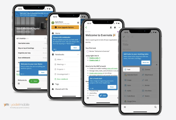
There are a variety of ways you can educate your users. In the below example, Evernote favours a functional approach, taking users through a number of screens to show them how to use the app. Alternatively, you can focus on communicating your value proposition by clearly signposting the benefits of your app. Finally, some apps suit the more intuitive approach of Progressive onboarding, where users are left to learn about the app as they go – educational apps such as Duolingo commonly use this approach.
Functional onboarding
Source: Yodel Mobile
While screens are the most common way of onboarding users, it might also be worth considering video, particularly if you’re looking to forge a deeper connection with your user. Mental health app Headspace favours this approach, and it works particularly well because a lot of the app itself is multimedia-based so it’s a format users are comfortable with.
Use design to your advantage
It stands to reason that the design of your app is going to have a significant impact on your user retention rate. It starts with the basics, ensuring that your product is bug-free and loads quickly.
From here, UX must-haves are commonly regarded as:
- Keeping it clear and clutter-free
- Providing intuitive navigation
- Following design convention guidelines
- Making tap targets manageable
- Including action confirmations
- Prioritising readability
- Making it accessible
And the last step in your design decisions? Making it look good. Colours should be contrasting, so users can easily see the various elements of your design. And those colours should be in keeping
Build loyalty into the app
Getting your users to stick around for the long haul shouldn’t be an afterthought, but a consideration baked into the initial build.
The aim is to encourage users to open the app regularly, and could take the form of rewards or in-app tokens to unlock new features, earned at key moments in the user journey.
Starbucks runs a loyalty program that rewards users with free coffee when they use the app regularly, while loyalty card Nectar invites users to “scratch to win”, taking the well-loved scratchcard experience online. Octopus Energy uses a virtual roulette wheel to achieve the same thing. This kind of gamification might have started with gaming apps, but it’s now a common approach in everything from eCommerce to health apps.
The ultimate in loyalty is a recommendation, and peer recommendations hold a lot of weight in today’s app-saturated world. According to Forbes, 81% of consumers’ purchasing decisions are influenced by their friends’ social media posts. By adding visible and easy-to-use social share buttons, users will be able to tell their friends and followers about your app, effectively doing your marketing for you.
with your brand and value proposition – your B2B networking app may not be the place to roll out that bubblegum pink logo… Finally, your in-app copy should also reflect your brand, and be consistent across all customer touch points.
Summary
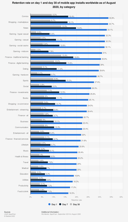
The obvious question this all leads to is “What constitutes a good user retention rate?”, and as this graph shows, it very much depends on the vertical in question.
Retention rate on day 30 of mobile app installs worldwide in 3rd quarter 2022, by category
Source: Statista
While there’s not been an app built yet that has achieved 100% user retention, what success looks like to you will depend on what you’re offering and the market you’re targeting. After all, a finance app targeting those over 60 is unlikely to match the engagement of a Gen Z- focused social app.
Here’s the truth: the battle to increase user retention is never truly over – there are always improvements to be made and new obstacles to overcome. It’s by regularly reviewing the data available that you can stay on top of any changes and make incremental improvements over time.
At Yodel Mobile, we are constantly working to increase user retention with our holistic approach that creates a unique plan for each individual app to help maximise the app’s performance. Our focus on the entire lifecycle of the app marketing campaign not only increases user retention rates but user acquisition and monetization as well. If you would like to learn how Yodel Mobile can help with any of your app marketing needs, contact us today for a free app review.
And who knows – maybe we can help you become the first app ever to hit that mystical 100% user retention rate!


