Hassle-free mobile app creative design
We touched on three topics in previous episodes that connect to create one major output: the creative strategy.
Those topics were:
- Audience and motivational drivers;
- Competition analysis; and
- Unique selling proposition and brand definition.
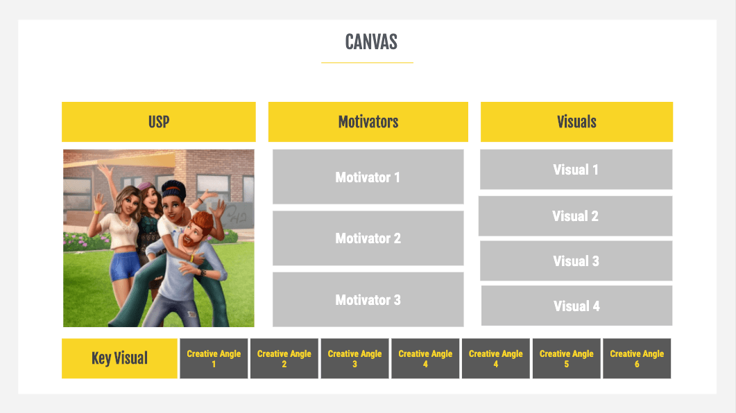
The creative strategy brings all these components together in one document that we call a canvas.
One of the benefits of using a canvas is that it speeds up the process of generating concepts that are aligned with how we want to present the app or game. The following––and never-ending––testing of different marketing creatives (videos, icons, and screenshots) uncover the form that resonates with the audience the most.
The process of developing a creative canvas starts with defining the messaging. We distill between 5 to 8 product essentials into a unique selling proposition (USP). Your USP is one punchy and inspirational sentence that packages and presents the product.
Here are a few examples of some USPs we defined at AppAgent for our clients:
- Clash Royale: Me against you
- Drive Ahead!: Become a master car gladiator
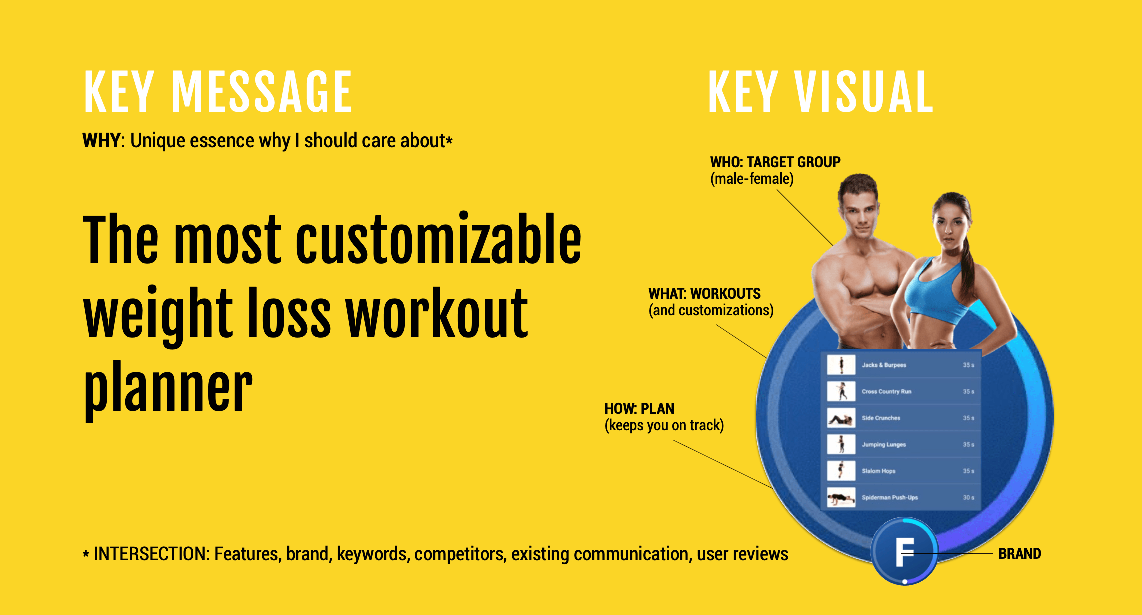
- Fitify: The most customizable weight loss workout planner
This USP is then represented by a key visual, which you can imagine as a “poster” for your app or game. An effective key visual expresses the USP without words and serves as a guide for all your marketing efforts. It provides direction on the theme, art style, and mood you want to consistently present to your audience across multiple channels.
It’s essential to include key information about your audience in the canvas. Focus on having the primary motivational drivers (learn more about motivators in episode 1).
The audience and their motivational drivers are then reflected in the visual elements representing your product which are matched to audience desires.
Fire Up Your Growth!
Moburst propelled leading brands like Google, Reddit, and Uber to the next level. Let’s ignite your Success journey today!
Claim Your FREE Growth Fuel!The magic of a canvas is how easy it makes the process of generating new ideas for mobile ads or store listings. You simply start combining motivators with visual elements, and, like LEGO bricks, they slot together to help you develop a new creative angle.
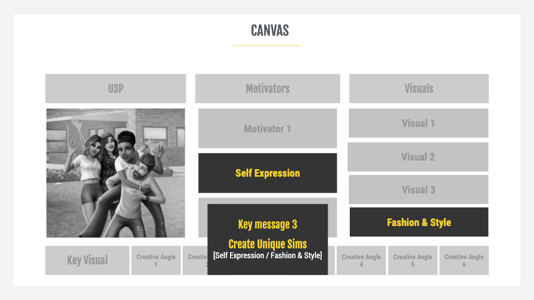
Below is an example from the game The Sims Mobile. The motivational driver of self-expression combined with the fashion and style visual element is brought together in the key message “Create Unique Sims”.
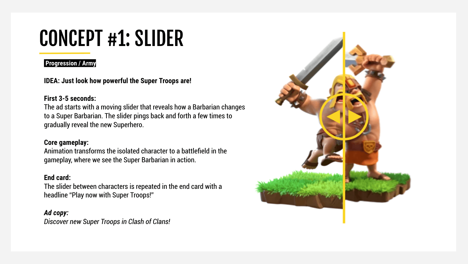
Once you have defined your brand and the creative approach of your mobile app or game (see episode 3 of the series), in-house or external designers can start developing concepts for new video ads or store assets. Below is an example of how we created a new idea for Clash of Clans built around the progression motivator and army visual element. You can see how these combine successfully in the final advert.
Check out the Clash of Clans Slider ad.
How ASO & UA should work together
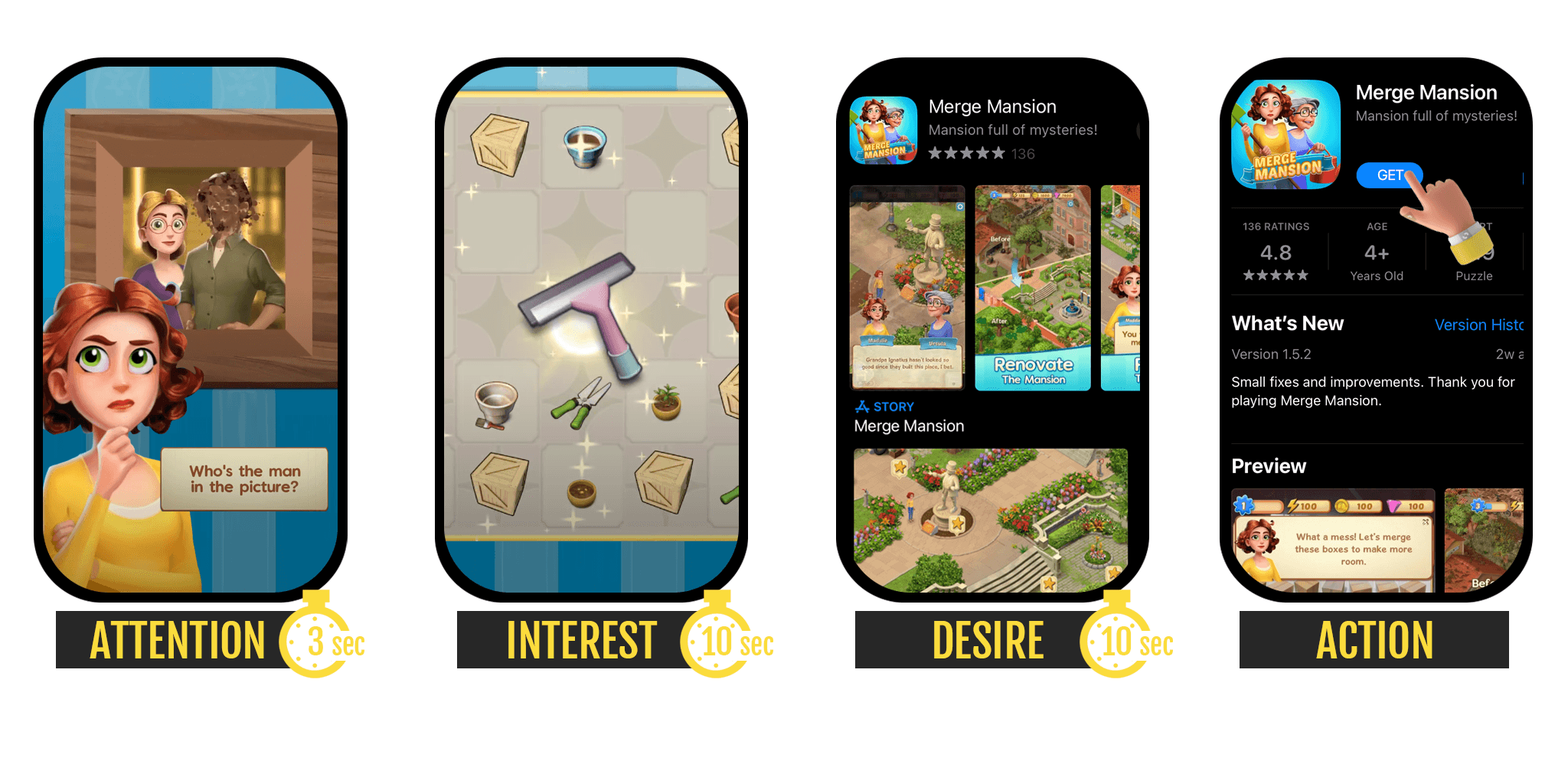
Every potential client or user forms an impression about your app or game from various pieces of information they collect over time. We can describe the core communication flow based on the standard hierarchical model AIDA, which remains relevant over a century after it was developed.
Here’s how AIDA works for mobile:
- Attention – mobile ad, first 3 seconds of it
- Interest – mobile ad, remaining 10-20 seconds
- Desire – store listing, exploration typically within 10 seconds
- Action – store listing, installing the app
Erik Hegely, Growth Manager at gaming publisher Pixel Federation, offers a valuable insight: “You could use it as a marketing tactic, where the mobile video ad teases the viewer about the game and gives a rough idea of 60% what the game is about. The store listing’s structure then aims for 90% to convince the user to install the game. And ideally, the gameplay then over-delivers and exceeds expectations by 120%.”
It should be clear that any major inconsistency between the previously mentioned touchpoints could damage or destroy the fragile mental picture that the user had created. The impact is that a conversion is far less likely.
A consistent user flow results in a better conversion funnel and higher quality traffic. Ultimately, you attract users that retain better, spend more, and are cheaper to acquire. All of this is thanks to a solid creative strategy that serves as a lighthouse for your marketing team.
Connecting ASO and UA also supports the mutual influence coming from your ad campaigns and store experiments. Strong and successful ad creatives on Facebook can serve as an inspiration for updating the store listing and vice versa. A winning store experiment might become a core idea for a new Facebook ad, for example.
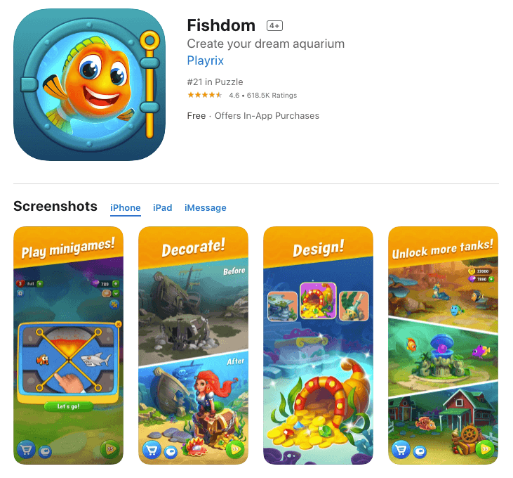
Not only that, sometimes, marketing can even influence product design. Just look at Fishdom and their mini-games which started as fake ads. (For more on fake ads, be sure to check out our next episode).
Closing remarks
A creative strategy developed in partnership by marketers and product managers establishes clarity about the purpose of an app or game and how best to position it for maximum appeal.
It helps to put in place a system for generating new creative angles without diverging too far from the core attributes of your product. It can also save valuable time in ideating new creative concepts!
The main benefits of having and using creative strategy are:
- High converting ads and store listings;
- Better quality of users; and
- Consistent brand building.
So why don’t you have one yet?


