“Video is eating the internet.”
You’ve probably heard that before. It refers to the rise of video as a content consumption format. And it’s true.
It’s especially true for Facebook advertisers. Video ads work. Really well. We’ve been watching them outperform still image ads for years now.
If you’ve been holding back from using more video ads because they’re expensive, stop. You might be reducing costs by avoiding video ads, but you’re also avoiding their upside, which is significantly better performance. The performance improvements of video ads are so significant that if you aren’t running them, we know you’re losing money.
Or maybe you’ve been avoiding video ads because they’re hard to create. There are solutions to that problem. You can either outsource video production, or you can make it easier to create video ads by leveraging Facebook’s Video Creation Kit, or by using some of our tricks to create video ads from still images.
But maybe you know how to do all of that. Maybe you’re running several video ads right now, and you’ve already got a nice system set up to generate and test new video ads every week.
Great start. But you’re not done. Because no matter how much testing you’re doing, we recommend you do more.
A lot more.
Here’s why: From what we’ve seen after working with nearly a thousand companies and managing more than $1.5 billion worth of ad spend (much of it through video ads), we believe know creative testing is the highest-return activity in user acquisition. It beats campaign structure, audience expansion, and ad copy testing – all of it.
Performance marketers are shifting budgets to Browser Advertising 📈
Learn how brands like Walmart, Expedia and Nike drive incremental growth by reaching high-intent users before they hit search.
Get Your Free GuideSimply put, creative testing separates the winners and the losers in UA management right now.
So with creative testing being that important and that powerful… how do you do it with video ads? And if you’re already testing a lot, how can you do it better?
Here’s how:
Use Quantitative Creative Testing
If you’ve been doing standard A/B split-testing up until now, Quantitative Creative Testing may blow your mind. It’s something we designed expressly for the performance UA ad testing environment. It gets around many of the problems with traditional A/B split-testing, like the expense and time required to reach statistical relevance.
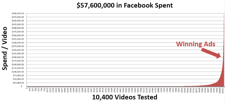
Quantitative Creative Testing operates on the principle of earthquakes over tremors. It works because most ads don’t perform. Maybe some ads do okay, but they don’t perform like breakout, 100x ads. And it’s the 100x ads you need if you want to compete today.
There’s an illustration below of what earthquakes look like in ad performance. We allocate ad spend based on an ad’s performance. So when you look at the chart below, you’re looking at the distribution of ad spend for over 520 winning ads. That slim orange column on the far right of the chart represents the tiny handful of ads that performed well enough to eat 80% of the budget. It’s that tiny fraction of all the ads we tested that Quantitative Creative Testing is designed to find.
This is what we mean when we say we’re looking for earthquakes, not tremors. We do not focus on ads that perform 5% or 10% better than the portfolio. We do not care about the middle of that chart. We’re looking for new winners – super-high performing ads that are good enough to replace the current winning ad before creative fatigue sets in. Typically, we have to test twenty ads to find one that’s good enough to beat the old control. Having run and tested well over 300,000 videos, on average we see a 5% success rate in finding new winning ads.
Quantitative Creative Testing uses two types of creative: “Concepts” and “Variations.” Concepts are completely new, out-of-the-box creative approaches. They usually fail, but when they win, they tend to win big. About 20% of the ads we test are Concepts. Variations are small tweaks made to Concepts. We take the big ideas and modify them just a bit to see if we can make them work better. 80% of what we test are variations.
We test a lot of Concepts quickly, accruing just enough exposure for these ads to know whether they could be big winners or not. Often, these ads are only 80% brand-compliant. We like to play a bit fast and loose with these early ads, both in terms of statistics and branding, so we can find the big winners fast. This saves time, saves a ton of ad spend, and gets us just “good enough” results to go into the next phase.
We’ll take the winning ads and – if they’re not brand-compliant – tweak them ever so slightly so they meet brand requirements, but still perform well. We’ll also take the ads that performed almost well enough to be winners and retool them a bit to see if we can’t get them to do better. We take the winners from the first round and start running them against our current best-performing ads.
This keeps us several steps ahead of creative fatigue, and – combined with careful audience targeting – lets us extend the life of our best creative. It is a constant process. We don’t just find a new winner and then twiddle our thumbs until its performance starts to drop a week or two later. We have a constant pipeline of creative being developed and tested.
Create a System for Creative Refreshes
Staying ahead of creative fatigue is challenging. The better your ads perform, the more likely you are to want to pour more ad budget onto them. And the more ad budget you spend on them, the faster they fatigue.
There are several ways to beat fatigue (we just mentioned our favorite, Quantitative Creative Testing). But one other way to extend the life of creative is to develop a system for Creative Refreshes.
We developed a Creative Refresh strategy for Solitaire Tri Peaks that leveraged our Creative Studio, competitive research, and gaming design best practices to deliver five new high-performance videos every week. This allowed Tri Peaks to get much more ROI out of their existing creative assets, all while maintaining (and even improving) ad performance and ROAS.
There are three flavors of creative refreshes: Iterations, Revisions, and Simple Changes. Each of these approaches uses the original ad much like a template but switches out one or two key aspects. After testing thousands of ads like this, we’ve figured out which elements of an ad tend to improve performance the most, so we know which variables to play with.
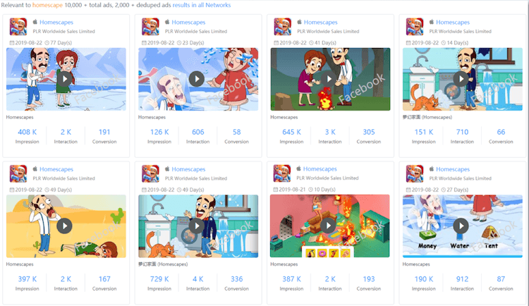
- Iterations add or remove one element from the original high-performing ad. In the ad examples below, we’ve iterated the original “New Concept” by adding a second, smaller brown cat to the iterated ad.
- Revisions give us room to make several changes to the template for a revision. Typical tweaks include resizing one or more elements, changing the header around, and/or swapping out different music.
- Simple Changes typically have one significant change, like making a localized version of the ad, changing the CTA, adding or swapping Start and End Cards, or changing the text in some way. In the examples below, the Simple Change was just to switch the ad’s language from English to German.
These four types of creative are our current approach to a la carte testing. It’s a process we are constantly testing and changing. Even three months from now, we’ll probably be using it just a bit differently.
Give the Algorithms What They Want
If you’re a creative who hasn’t been updated on how the advertising algorithms at Facebook and Google work now, you need to fix that. Like yesterday. Because any UA team that wants to succeed now needs to let the algorithms figure out ad placements. The machines do this work more efficiently than humans can, and not handing over this part of campaign management in Q4 2019 is going to hurt campaign performance.
This full shift over to algorithm-managed bids, placements, and audience selection actually has big consequences for how we design video ads. We’re now basically just telling the ad platforms what we want and then sitting back and letting them deliver those requests, so we need to give the algorithms enough raw creative assets to do their jobs.
At the very least, create four versions of each ad: one for each of the viewing ratios shown below.)
You have to do this because humans aren’t controlling ad placements anymore. The algorithms do that now. If you give the algorithms only one video ratio, they’ll be severely limited as to where they can show your ads. You don’t want that – it will cripple your ads’ performance.
If that’s more work than you want to do, try this trick: Don’t make ads in all three ratios at first. Instead, run the first versions of all your new ads at the image ratio used in the newsfeed: 16:9. This will allow you to do a quick but effective test in a controlled “apples to apples” way. Then take the stand-out ads from that first round of testing and make them into the other two ratios. This saves a ton of work, as you only have to make three versions of winning ads, not three versions of every single ad you test.
By the way… just making your winning ads into three versions with three different ratios isn’t enough. At least not according to Google. They recommend you also give their platform three different lengths for each of your videos: 10 seconds, 15 seconds, and 30 seconds. Depending on where the algorithm shows your ad, those different lengths could result in very different performance metrics. And again, because the algorithm – not a human – is the entity figuring out optimal placement and audience combinations, we need to give it every opportunity to find the sweet spots.
If just the idea of making nine different versions of every winning video makes you feel tired (three ratios times three lengths), no worries. Our Creative Studio can make those versions for you.
Do Regular Competitive Analyses of Your Competitors’ Ads
Now that the advertising algorithms have taken some work off your plate, we highly recommend you spend more time doing competitive analysis. And do it in a systematic, documented way. We recommend using Sensor Tower’s share of voice feature to help you uncover the advertisers and creative that matter the most. It’s also enough to give you hundreds of ideas for your own ads.
Here are a few possible columns for a competitive analysis spreadsheet:
- Advertiser
- Title
- Date
- Platform/Network
- Length in seconds
- Call to action
- Main Colors
- Mood
- Text density (the amount and size of copy)
- Which words they emphasize
- Screenshot or recorded video
- Logo placement
- Similar to other ads they’ve run… how?
- What to test in your own ads based on this ad
As you review your competitors’ ads, also look for:
- Storytelling tactics
- Messaging
- Which emotions they’re trying to evoke from the viewer
- How the product is used in the ad
- Colors and fonts
There’s a real art to doing competitive analysis. To do it well requires someone with both a creative and analytical mindset. So if you’ve been worried about keeping your skills current through the massive changes going on in UA, learning how to do great competitive analyses would be a really smart way to keep your skills up.
Test Ad Features
There’s an old concept in testing that describes testing different levels of things as testing “leaves” versus “trees” versus “forests.”
For instance, you can test call to action button colors. That’s an easy, simple, and very popular thing to test.
But it’s only testing leaves. It’s not going to get you very far. Sure, button color can get you a lift. A little lift. But most testing experts will roll their eyes at button color tests and beg you to think bigger. They’d want you to test “trees” and “forests,” not tiny, somewhat insignificant things like button colors.
Start and end cards are a great example of this. These two frames – at the end and at the beginning of ads – can make a major difference in performance. They help lure viewers in, and they can impress viewers with a strong call to action at the end of the ad.
But if you’re caught up in testing button colors, you aren’t going to have time to test big things like Start and End Cards. Or any of the other powerful ad features Google and Facebook are rolling out practically every week.
So be choosy about what you test. Test to find earthquake-level improvements whenever you can, not just tiny improvements.
This approach is, of course, very similar to Quantitative Creative Testing and the idea of concepts versus variations. But it refers more to the structure and features of the ad vehicles themselves. Google and Facebook are giving us some really cool toys to play with these days. Go try them out… even if it means you can’t test ten different shades of red on a button.
BONUS: Creative Testing Best Practices
Once you have creative ready to test, we recommend the following Creative Testing Best Practices. While you can test all your ads to statistically significant (StatSig), we don’t recommend this approach. StatSig is an extremely expensive and slow process. Instead, we recommend testing as follows:
- Test radically different concepts and only modify winning concepts.
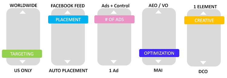
- Restrict Targeting: US, Facebook Newsfeed, iOS or Android. The Newsfeed, Instagram, and the Audience Network all have wildly different performance KPIs. We recommend isolating your testing to reduce variables.
- Target 100 Installs. For most games/apps, getting 100 installs is enough to get a read on IPM (installs per thousand), so use this as your initial KPI to determine “potential winners.”
- Always run a Facebook Split Test (3-5 videos + Winning Video).
- For the three to five concepts you should test at a time, the goal is to kill the losers quickly and inexpensively. You will get both fast negatives and false positives on the margins, but you’ll know an earthquake when you see it – 100X ads stand out. The ads that do well, but don’t blow the doors off, are what we call “potential winners.”
- ROAS Test: Take your potential winners and drop them into ad sets with your winning creative. Then let the gladiator battle begin. If the new video gets a majority of impressions, Facebook has named it the new winner. If it gets some impressions but it stops delivering quickly, we recommend re-testing/enhancing creative if it is within 10% of the winning video’s performance.
Conclusion
The smartest performance advertisers have always known creative testing is where the bulk of performance gains are to be found. It was true back when Claude Hopkins published Scientific Advertising in 1923, and it’s true now.
If you really want results, test. Then test again. Then test more. Test strategically and repeatedly. Even in late 2019, the vast majority of advertisers aren’t doing anywhere near enough creative testing.
Fortunately, that is really good news for you.


