Today, app discovery has changed fundamentally from where it was just a few years ago. Users are discovering new apps based on ads they’ve seen in other apps or on social platforms. As the stores become increasingly saturated, paid user acquisition campaigns have taken the lion’s share in terms of downloads. Organic downloads no longer happen at the rate they once did, and app store optimization, or ASO, has evolved with it – becoming an inseparable part of the UA funnel.
When organic downloads still ruled, ASO was all about ensuring your app was discoverable in the stores (think: keywords, reviews, categories). Now that more and more apps are acquiring users via paid channels, marketers today are paying attention to the entire funnel and not just one part of it. The new ASO is about ensuring that users who land on your app’s store page from paid campaigns, are primed for download.
Get to know the stores
While serving the same purpose, Google Play and Apple’s App Store do have a number of differences. An effective ASO strategy is contingent on a deep understanding of the dozens of differences in the stores, and how they’re structured and function. If you decide to apply the same assets to both stores, we recommend testing them first.
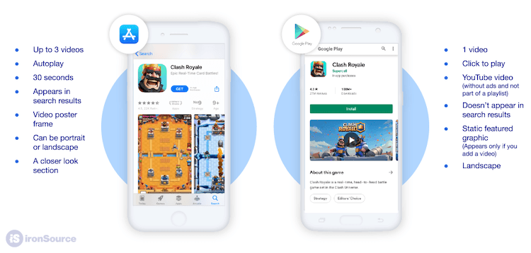
Take videos for example. On the App Store they autoplay, whereas on Google Play they’re click-to-play. This means that the majority of people who land on your page on Google Play won’t actually watch the video, so the image behind the play button should be more visual. This may seem like a small difference, but being able to test and then implement the best options will ensure you’re moving more potential users through your UA funnel – ultimately increasing conversion.
No matter which store page you’re optimizing for conversion, the most important factor is to ensure that the message you want to communicate is front and center. Many users don’t have the time or patience to scroll through large galleries or long pages. Your first impression is the one that counts, so make it sharp and to the point.
Test, and then test again
Put simply, an optimized app store page will increase install conversion rate which will make your marketing campaigns (and therefore marketing spend) more successful and efficient. A/B testing is the only data-driven way to discover which components inside of your app store page positively impact your metrics, minimizing the risk of applying assets that will have a negative impact on conversion.
When it comes to A/B tests, first choose your testing platform. One option is to use a third-party platform that sends a portion of your traffic to an external testing page that duplicates the look and feel of your existing page. This allows you to split the traffic of your users and fairly test different aspects of your app store page. If a user sent to the cloned page decides to follow through and download the game, they’re automatically redirected to the real store page.
The second option is to run native A/B testing for your store page – which is only offered by Google Play. This tool is free and allows you to start a test directly on the Google Play console and then easily apply the changes once the results are in. With this tool, you’re able to test both graphics and text in order to find the winning setup.
A/B testing your app store page isn’t just a nice idea, it’s a must. Without effective tests, you risk harming your conversion rate and wasting marketing spend. This doesn’t mean that testing is not without its challenges. For example, when using the third-party approach, the redirect to your real app store after the click to install will provide a less than optimal user experience. However, the findings will improve the user journey in the long run, resulting in an overall uptick in conversion.
What should you test?
Concepts and themes for your potential tests can be based on trends in the game and app ecosystem, competitive analysis, trends in pop-culture, insights that your in-game data has highlighted, and a lot more. Being aware of what’s going on in the market will help you be creative and stay one step ahead of the game.
When it comes to testing, the possibilities are endless. Here are a few examples:
Context-aware tech: The secret to 81% more conversions
Learn how leading apps are using context-aware technology to deliver perfectly-timed offers, reduce churn & transform passive users into loyal fans.
Learn moreCharacters
If you know that users react positively to a specific character in your game, consider testing them in your icon or in the images and videos displayed on your app store page. Just because users react positively to certain characters in the gameplay doesn’t necessarily mean that these characters will drive conversion – so testing the theory is crucial.
Localization
Picture this scenario: a user is served an ad for your app in French, they click and are redirected to an app store page in French, and then they download your app which is in English. Yes, localization probably pushed the user further down the UA funnel, but if your game isn’t also localized then it may actually harm user quality and experience. However, localization doesn’t necessarily work for everyone. Our research has shown how app store localization is very language specific, with some requiring as much as possible and others preferring to stay in the game’s language. Localization is a lot more than just language.
Videos of gameplay
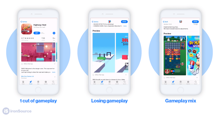
Hyper-casual ads that depict challenging gameplay tend to convert better than those with easy gameplay. However, ads for match-3 games convert better when the gameplay shown is on the easier side. But as with everything, take this example with a grain of salt, because ultimately you’ll know what converts best only once you’ve A/B tested.
ASO is a process…
…and small changes make a big difference. ASO is no longer just about winning search and organic traffic. As paid UA increasingly grabs the lion’s share of app downloads, ASO has evolved and now includes making sure that users who engage with your paid campaigns are being pushed through the entire UA funnel in an effective and optimized way – that has been tested, tested, and then tested again.


