Making an ad creative that not only attracts but also engages the target user is the key challenge in successfully marketing a mobile app or game. What once worked like magic may no longer be effective, requiring marketers to constantly delve into the science behind ad creative production. In this article, AdQuantum Design breaks down the structure and mechanics of successful ad creatives, explaining how they work in practice.
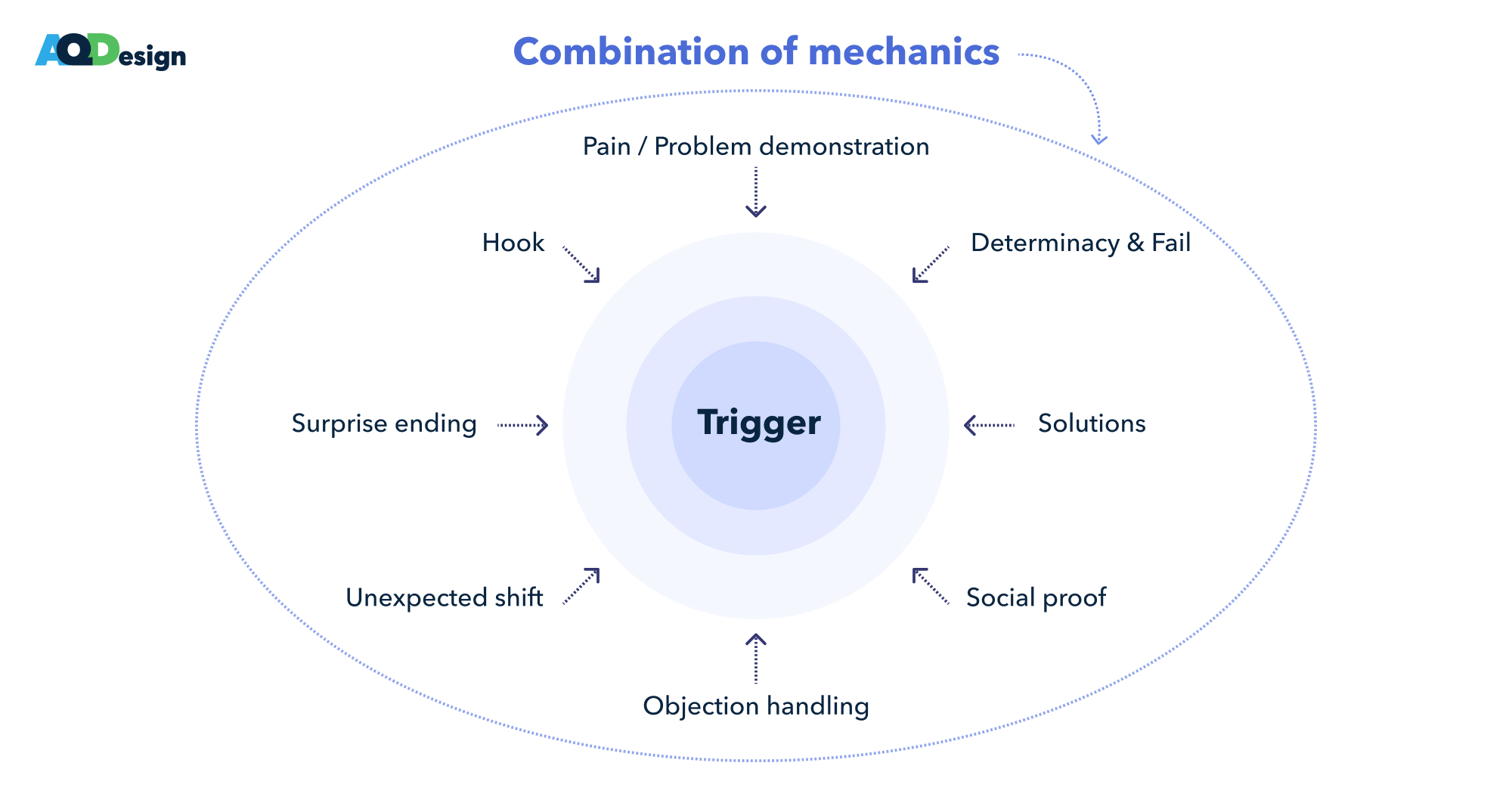
Types of engagement mechanics
Source: AdQuantum
The techniques used in creatives are numerous, and all of them are aimed at activating a user and satisfying their motivation. Here are some examples of trigger mechanics usage:
Hook
An ambiguous statement that piques the user’s interest, denial, or righteous anger.
The first 2 seconds of the video focus on a controversial yet captivating statement: that one can lose weight by eating pasta and bacon. This elicits both scepticism and curiosity. In both cases, it engages the viewer. Some want to figure out the catch, while others simply await more details.
Pain demonstration
Used for non-gaming creatives, addressing recognizable motivations and often addressing taboo topics.
The attention-grabbing beginning reflects the user’s motivation or goal. The Pain demonstration in this creative is the display of a beautiful, ideal abdomen which reflects the goal/pain point of many users.
Problem demonstration
Applicable to gaming projects, directly showcasing gameplay problems and their solutions. The best way to use this mechanic is by showing actions that clearly don’t solve the problem, leading users to feel superior and want to demonstrate the correct approach themselves.
First, we showcase a problem with an obvious solution. Then, we address this problem but introduce errors at each stage. This approach effectively triggers the user’s emotions, igniting a desire in them to tackle the level themselves.
Determinacy and fail
Showcasing an action that clearly won’t solve the problem, thereby triggering a sense of superiority in the user and a desire to demonstrate the correct method. It’s preferable to illustrate the principle by which this problem can be solved, but ultimately, we make a mistake that leads to failure.
Fire Up Your Growth!
Moburst propelled leading brands like Google, Reddit, and Uber to the next level. Let’s ignite your Success journey today!
Claim Your FREE Growth Fuel!In this video, determinacy is represented by the hero’s repeated mistake of slightly missing the target to obtain a bonus and then switching to the next target. In the beginning, the principle of obtaining the bonus is demonstrated. This means that the viewer understands what needs to be done, but the hero does it incorrectly, and not just once but several times in a row. All these actions elicit an emotional response from the viewer, prompting them to take the desired action.
Solutions
Demonstrating the user’s problem-solving in the creative.
This video demonstrates the simplest and most effective way to address user problems. It starts by showcasing problem areas that should resonate with the target audience, followed by a series of exercises performed by a model in great shape. Contrasting these two models not only highlights the difference but also serves as motivation.
Social proof
Demonstrating expert advice or recommendations.
This creative incorporates two types of social proof simultaneously. The first one is highlighted in the intro to grab more attention. It relates to personal opinions and recommendations, presented in a tweet format for increased trust. This makes the creative less like an ad, leading to improved audience retention.
To maintain this engagement in the middle of the video, another form of social proof is added, this time referencing a well-known personality, specifically NFL players. This choice isn’t random, as the creative targets a male audience, and almost every man has heard of the NFL in some way. This “familiar face” enhances user interest and loyalty.
Objection handling
Addressing potential user objections and guiding them towards app download or subscription.
In this video, addressing objections starts with engaging the audience and breaking the fourth wall with the message “Do you think this is just another mobile game ad?”. Then, in the established dialogue with viewers, the blogger addresses potential questions and concerns – “You can withdraw money without risk,” “There is no minimum amount for withdrawal,” “It’s completely free”. Each subsequent statement leads the user to install the app.
Unexpected shift
Unexpected location changes, new problems from past mistakes, or minor actions leading to major consequences, creating a desire in users to “replay” or try again.
The first half of the video seems unrelated to the game. However, this is only apparent at first glance. After watching the entire video, the logic and an adjacent mechanic become evident. Such a turning point event works to maintain attention.
Surprise ending
A surprise ending is a narrative or visual twist within the ad, ranging from a sudden plot twist, an unexpected reveal, or a dramatic shift in the storyline, that leaves a lasting impression on the viewer, encouraging them to take action or explore further.
This creative uses a major catastrophe – which is a location collapse – as an unexpected twist. The surprise element builds gradually as users witness smooth progress and expanding production, only to encounter an error at the end that nullifies all their efforts. This technique is designed to grab users’ attention and encourage them to choose ‘the right way.
Combination of mechanics
When a creative combines two or more of the above-mentioned mechanics.
This creative combines two mechanics. The first one involves production settings, which is a gamified but modified mechanic. To broaden the audience, a second adjacent mechanic related to roadworks has been added.
Creative structure
The structure of any artistic work, including ad creatives, follows the same rules, with adjustments for the product’s specificity.
For a creative, you can outline such a universal scheme:
- Intro
- Setup
- Main part
- Turning point
- Climax
- Outro
This scheme applies to both gaming and non-gaming projects, with variations in content and visual solutions.
The first 3 seconds of the video are crucial, as it’s during this timeframe that user interest is captured. If interest isn’t captured, the user is likely to just scroll past the ad, unless it’s an interstitial placement or a rewarded video. That’s why it’s so important to pack the most important and catchy moments into these 3 seconds.
Hooks, triggers, pain points, and problem demonstrations work best right at the beginning. Then, it’s logical to transition to explanation and creative development. However, a hook can be repeated in the middle of the creative for added effectiveness.
Social proofs, a turning point event, and determination are best used in the first half of the creative, as these techniques can help retain users, gain their loyalty and interest, and increase viewing depth.
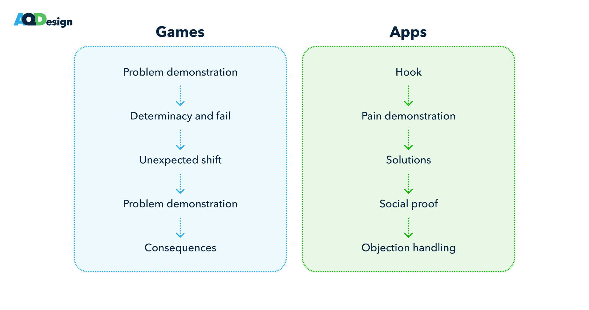
For gaming projects, an ideal user retention scheme includes:
- Problem demonstration
- Determinacy and fail
- Unexpected shift
- Problem demonstration & fail
- Consequences
For non-gaming projects, the ideal formula comprises:
- Hook
- Pain demonstration
- Solutions
- Social proof
- Objection handling
Games vs Apps
Source: AdQuantum
Key takeaways
- Avoid lengthy introductions in creatives and aim to place as many attention-grabbing moments at the beginning of your creative as possible. Ideally, fit them into the first 3 seconds since, on average, that’s when user attention is captured.
- All of the engagement techniques should primarily target user motivation. If a mechanic used doesn’t align with the user’s guiding motivation, it will simply attract the wrong target audience which will end up as non-paying users and low LTV.
- It’s crucial to use the engagement mechanics in creatives at the proper time frames and sequences. For example, consequences are always shown at the end of the mobile game video while the most effective approach is to place hooks, triggers, pain points, and problem demonstrations at the beginning.
- Don’t be afraid to use multiple mechanics within one creative if they all align with the motivations of your app’s or game’s target users.


