Product marketing positioning in the context of other apps and games
Many companies become obsessed with focusing on the competition, when instead they should concentrate on customers.
While all marketing activity should start and end with the customer, understanding the competitive landscape you operate is critical at helping you to define a unique position in the market for your mobile app or game.
Here are some examples we all know:
Volvo is “Safety”. The North Face is “Exploring”. Candy Crush is a “Tasty puzzle game”. And
Clash Royale is “Me against you”, a position we defined at AppAgent.
There is no other car brand on the planet that uses safety as effectively Volvo, and no other puzzler as sweet as Candy Crush.
Each proposition is unique. It makes no sense to copy someone else. Instead, you must understand how your competitors position themselves, and use this to define your own unique selling proposition. (In the next episode, we describe how to create your USP.)
How to analyze your competition using the App Store and Play Store
Begin by mapping your direct competitors, including those that offer the same experience, or fulfil the same motivators.
Your competitors could be games that offer the same core gameplay, or apps that serve a specific need (such as food delivery or trading stocks).
You can use the store algorithms to help identify your competitors. Explore suggestions in the “You Might Also Like” in the App Store and “Similar Apps” in the Google Play Store. Check the App Store and Play Store charts to see what apps are most popular in your category. Identify gaming YouTubers who might be a good fit for your title.
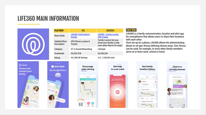
Once you have compiled a list of competitors, focus on how each product presents itself in the app store as well as in ads. You can use platforms such as ad intelligence tool Apptica or Facebook Ads Library to help you with this.
It’s easier to demonstrate how this works in a real-life example:
Once you have completed the list, zoom in on what competitors say about their app or game.
It’s also useful to understand how they say it. You must explore the execution of their unique selling proposition, and the key messages that they use to support it.
There are two ways for you to achieve this:
By checking best-performing ads
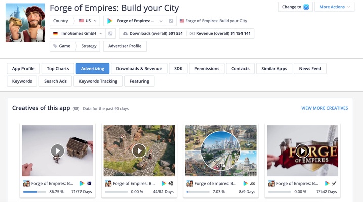
You can use ad intelligence tools, such as Apptica, to search for ads with the highest number of impressions. More impressions mean the client has put a bigger marketing budget behind the creative, which often translates into a positive return on ad spend. If the ad has been live for more than a month, you can say with confidence that your competitor has hit on something that works.
Here’s an example. On the bottom left of the Apptica screenshot, you can see that a cinematic building ad is responsible almost 87% of impressions tracked for Forge of Empires. This is clearly the best performing advert for this Hamburg-based developer. (If you want to gain some valuable insights about this ad, we recommend you watch Mobile Ad Eaters episode 3, with Fabian Weiske from Innogames.)
By checking best-performing store experiments
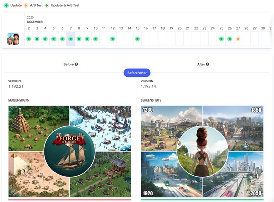
Not many people know that Apptweak, another frequently used tool at AppAgent, has a powerful feature called Timeline. Timeline visually shows updates in the Google Play Store, including experiments.
Using Timeline, it’s easy to see which experiments were applied to the main store listing. Long-term trends can give you a certain degree of confidence in what works for your competition in terms of messaging, art style, layout, copywriting and more.
Using the techniques above should provide significant amounts of material about your competitors, including their creative approaches and testing strategies. The next step is to pull practical learnings from these materials, a process which we have illustrated a practical example below.
Case study on insights mining from Google Play Store experiments
Let’s say you are a publisher of a casual puzzle game such as Merge Mansion by Metacore, a Supercell-backed studio from Helsinki, and one of AppAgent’s clients. You are about to revamp your screenshots, and you think looking at the puzzle category leader, such as the Russian publisher Playrix, might be a good idea.
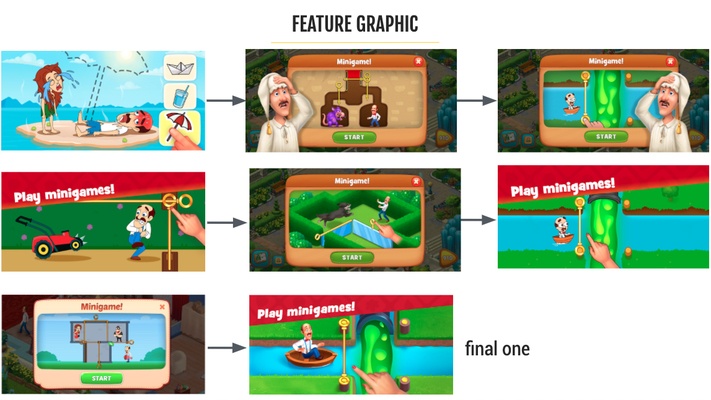
By checking their experiments, you can learn what assets your main competitor is testing. You can see if they use headlines in screenshots, which parts of the game they highlight in the first impression frame, what character style performs the best, and much more.
When analyzing the feature art, you can see that all are connected to their fake ads, also known as minigames. This makes a lot of sense because the visual is beside the icon, the first element store visitors coming from ads see. It’s clear that Playrix is clearly trying to build a consistent user journey throughout all their visual assets.
You can see that the simplest, and visually clear execution, is applied in the store these days. All elements are enlarged and the used character has a polished look, (the small, cartoonish approach didn’t work out).
If we look at the first screenshot here, there is much more that we can learn:
- First, Playrix is working a lot with motivators. Each tested screenshot touches upon a strong emotion: from moving your flat (“What’s Next?”), over the process of making your place nice to solving mysteries. By viewing the publisher’s entire portfolio, you can see the laser-sharp focus of each asset.
- One-word headlines work the best. Again, Playrix uses this tactic across multiple games. Its competitors, such as Tactile, also follow this trend.
- The headline is always in the top left. This is effective as people tend to “read” screenshots as they read the text, from the top left to bottom right. It’s a valuable insight for any designer!
- Moreover, the building and transformational aspects are what resonates the most with users. It’s definitely something we thought worth testing, and was an inspiration for “our” Merge Mansion creatives (see one of the final ads by AppAgent).
When the research is completed, it’s time to draw some conclusions. I recommend you follow this five-step approach to making your final synthesis.
- What patterns do you see around – can you identify patterns within your category or direct competitors?
- Try to understand what’s driving them – understand why some things work and others don’t. Explore how your customers might react to certain messaging.
- Which things you consider inspirational – compile a mood board either digitally or with printed samples.
- What do you want to do differently – be clear in your thoughts and discuss observations with the team. Reflect on what works and what doesn’t make sense for your brand and audience, and use it to define your innovative and unique approach.
- Summarize main takeaways – use them as a brief for the ideation and design process.
My personal tip here is to complete these steps in a small team of two members. A creative and a marketing professional will naturally have different perspectives and hypotheses, which can bring a richness to the discussion and go a long way to finding the best angle for your product.
You must include these final take-aways into your creative strategy, creating a single document that is shared and used by all teams. Otherwise you risk that no matter how valuable insights are, they will get lost on your drive without practical use.
Lessons to learn
As we have demonstrated, there are strategies you can use to shorten your path to improving your top of the funnel metrics – be it a click through rate of your ads or install rate in the store.
Such research will help you to define your own “playfield” and give guidance to everyone involved in the creative process. Don’t restrict yourself too much, because only proper testing will establish what works.


