When targeting Mobile UX, our primary target is to offer a better user experience; otherwise, it may affect the success rate.
A designer should consider various essential aspects, like user context, navigation, content (simple and clear), UI elements selection, easy registration and logins, onboarding screens, fat-finger friendly, touch targets, and more. Well, almost all such aspects are considered, except for fat-finger friendly and touch targets, which are mostly missed or overlooked.
When mobile usability testing is a matter of concern, fat finger syndrome comes our way, which may spoil the user experience.
However, a few blame the users for being clumsy while operating their mobile. But, here, your UI is at fault. The UX designer is accountable for a good design eliminating factors that may make the users frustrated or confused, and offering the users a compelling and expected experience.
Fat-finger errors among various mobile UX issues arise when you fail to consider multiple aspects, like spacing between elements, their appearance on the small screen, and more.
This post will show you how to make your mobile UX fat finger-friendly.
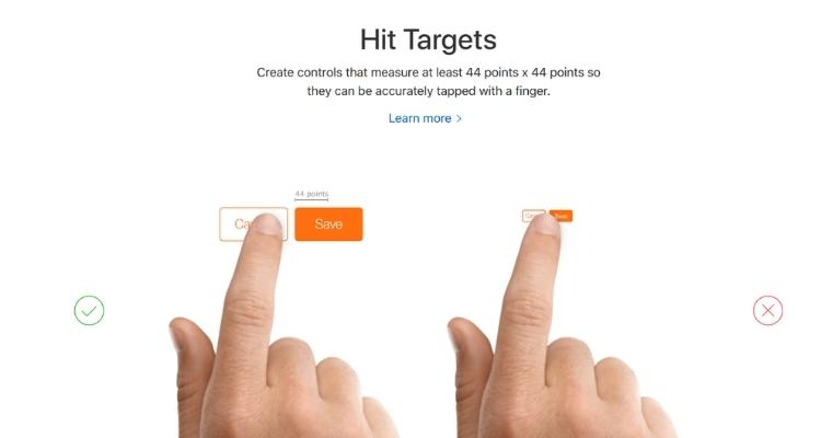
Hit targets
Source: Emizen Tech
Consider the below points to make your mobile UX fat-finger friendly
Large touch targets are a must
Let’s consider the main issues with small touch targets.
- Users need to reorient their finger to tap the target
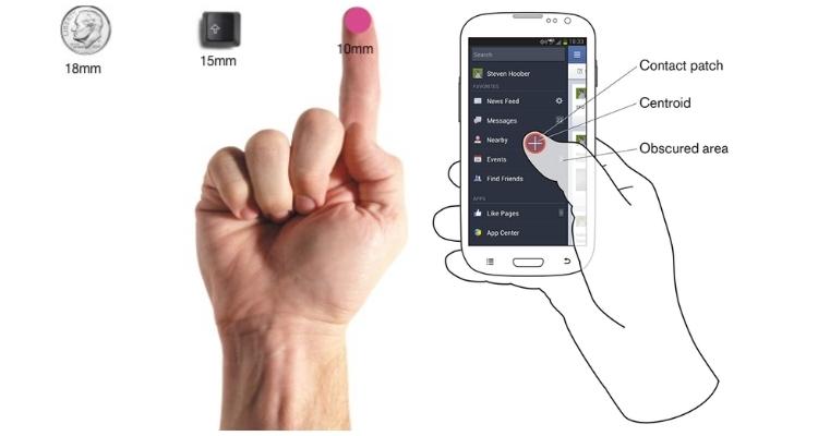
UX with small touch targets may make the users work harder as they need enhanced accuracy to tap on the screen. It will demand users to reorient their fingers to tap the object with clear visual feedback, from the finger pad to the fingertip.
Using the finger pad may hide the complete object (to hit), making users unable to see the target to hit.
Ultimate App Growth Guide 2025
Boost your app’s success with the Ultimate App Growth Guide! 🚀 Expert insights, proven strategies & must-know tips. Download now!
Master app growthUsually, users use their fingertips to hit the small touch targets as it offers them the visual feedback they want to know that they are hitting it accurately.
Reorienting their finger slows down their movement and makes them attempt harder to hit.
- Users accidentally can hit the wrong target when small touch targets are grouped
Obviously, when the small touch targets are grouped, users can, by mistake, hit adjacent targets and trigger unintended actions.
This is because the user’s finger width is extra than it reaches the nearby buttons. Users usually make such mistakes using their index finger. They can also use their thumb and get in trouble as the thumb is larger than the target. Sometimes, users must tilt their thumb and use the thin side to hit the target, which may annoy them.
So, small touch targets make things challenging for users, where a finger-friendly UX is required to fight such errors.
Button size of touch screen applications
Source: Emizen Tech
Width of an average user’s thumb in pixels
Many users prefer using their index finger to tap the targets. But, users using their thumb are also no less.
The primary difference between using the index finger and thumb is that the latter is wider than the former.
The average width of a thumb (adult one) is 1 inch (2.5 cm), which converts into 72 pixels.
It does wonders for the users who use their thumbs to hit. They are faster and easier to hit as they permit the user’s thumb to fit comfortably inside the target. It lets the edges become visible easily from all angles.
So, users don’t need to reorient their thumb to its tip to make it hit the target. Moreover, they don’t have to tilt their thumb to its side to hit. Just one tab using their thumb pad will work as expected.
A study on target size for one-hand thumb use on small touchscreen devices says that user errors have witnessed a fall with the increased target size. Users can tap the touch target faster without reorienting their thumb or making it tilt to its sides to hit.
One more study for target selection on touch key design of mobile phones found that the errors diminished with the increasing touch key size. Additionally, it uttered, “the larger the touch key size, the higher the convenience and success rate.”
A study of human fingertips to know the mechanics of tactile sense says that the index finger’s average width is 1.6 to 2 cm (about 16-20 mm) for most adults, which converts to 45-57 pixels. It’s wider than the suggestions from mobile guidelines.
Size of touch targets
A touch target 45 – 57 pixels wide facilitates the user’s finger to fit easily inside the target, making the target’s edges visible when the user taps it. This way, the user catches up with clear visual feedback that they are accurately hitting the target.
According to Fitt’s Law, the time to reach a target increases with the smaller target, that in turn slows the users as they need to be more attentive to hitting the target accurately.
So, a designer should craft a finger-sized target to let the user hit it accurately without any hassle.
Opt for thumb-sized touch game-control targets for gaming apps
Another consideration is when to prefer a thumb-sized target over an index-finger-sized touch target.
Well, it’s pretty challenging to know whether the users prefer using their index fingers or thumbs on your app. However, most users will likely use their thumbs to play if yours is a gaming application.
That’s why thumb-sized targets are helpful, especially for gaming apps. You can make your game control targets thumb-sized to let the users better control and handle their play. They can see the game-control targets as they will move their thumbs, and the game will start appearing to be more adaptive to them.
Finger-sized target is ideal, though not always practically suitable
The finger-sized targets invite various benefits, but it’s not always ideal to use them in every scenario. Like, a mobile device arrives with a limited working space, which means having multiple finger-sized targets on a single screen will demand more space, more than a screen can afford.
On the contrary, the same mobile screen size would be perfect if you have a few finger-sized targets that can fit with no issue.
So, before choosing the size of the touch targets, be sure you measure the size of your touch targets and screen and conclude which would be the best fit.
As general guidelines instruct, you can apply finger-sized targets more perfectly on a tablet than on a mobile device as its screen space is more comparatively. You can use it on tablets without any second thought and improve its usability swiftly.
Mobile devices make the touch target hit trouble for the users. So, the designers must decide how to make the most of the finger-sized targets on the mobile screen to make the navigation minimal and straightforward.
Key takeaways
Of course, mobile UX needs to be fat-finger friendly with best-fit touch targets to enhance the user experience and make your mobile user-friendly.
So, choose a good designer who holds the required skills to make the navigation simple to use. He needs to ensure the accurate size of the interactive elements and every needed aspect to emerge with a design that may lead to reduced errors and smooth navigation.
After all, it is all about the app and developing the same is a crucial step on the ladder. With our team of experienced and visionary developers, Emizentech ensures that your project is in the right hands and brains. With our experience of over a decade in the industry, we don’t only give you the app but also the right guidance and support to begin your digital journey.
Contact Emizen Tech to share your idea and get your feature-pack app ready to launch. Go for our one-hour free counselling to discuss the idea and take the right decision.


