Over the last decade, B2C apps have used push notifications, SMS, and emails to bring users back to their apps 📲, and these tactics have seen great success in increasing retention rates, repeat purchases, etc.
But now with every app resorting to these channels, they’ve become overly saturated. Consumers are bombarded with marketing messages across these channels, and it can be challenging to cut through the noise.
We strongly believe that the next level of growth for consumer internet companies will be driven by real-time in-app user engagement 🔁.
The declining relevance of push notifications
An average consumer in the US receives 46 push notifications a day. Apps are facing challenges in distinguishing their messages amidst this crowded notification landscape.
No wonder the effectiveness of these channels has nosedived 📉 in the last decade. Average CTRs now fall in the 1-2% range.
Though push notifications will stay around for the long term, growth and marketing teams must supplement their off-app communications with in-app channels to engage users and drive growth.
Driving growth with in-app engagement
In-app engagement empowers product and growth teams to deliver impactful experiences inside the app. You can effectively interact with users, tailoring messages based on demographic and in-app behavior.
In-app campaigns can serve to drive crucial metrics like:
- Activation rates
- Engagement and adoption
- Conversions and revenue
Some UI modules used to communicate with users include stories, videos, native widgets, or nudges like tooltips, spotlight, sliders, floaters, etc.
Context-aware tech: The secret to 81% more conversions
Learn how leading apps are using context-aware technology to deliver perfectly-timed offers, reduce churn & transform passive users into loyal fans.
Learn moreThe best-in-class B2C apps in 2024 are already using in-app engagement to reach users on their terms. Let’s look at a few examples.
UI modules
Source: Plotline
Improving user activation
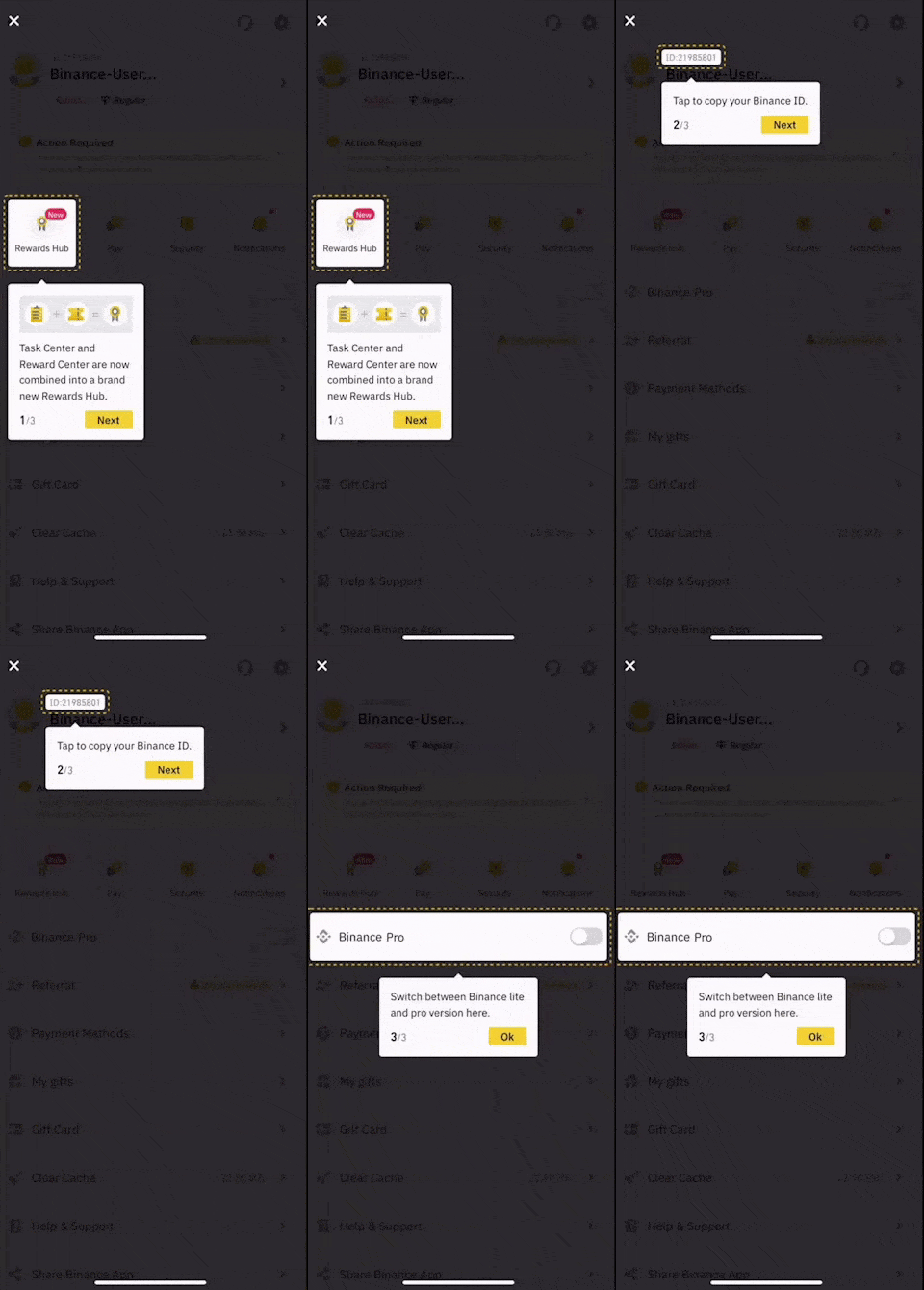
Binance uses a guided tour to educate new users
Binance uses a tooltip-guided tour to educate new users and help them on their way to making their first trade. This leads to a rise in activation rates and over time improves retention and LTV.
Binance’s guided tour to educate new users
Source: Plotline
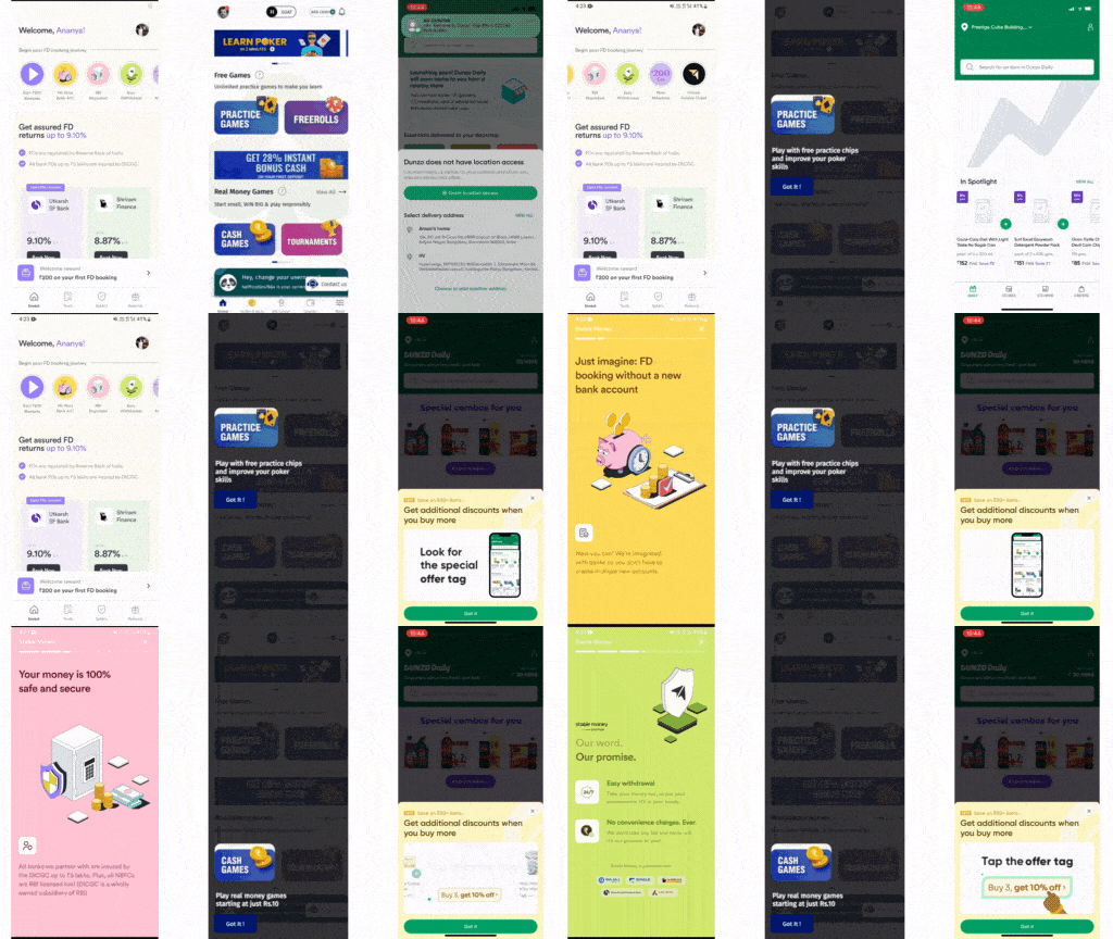
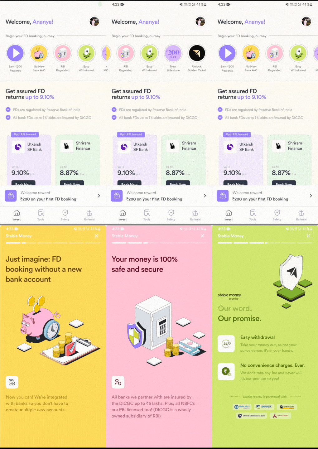
Stable Money uses stories to communicate its value proposition
Stories have worked well for Stable Money to drive home key messages or share special offers because they are short, simple, and easy to consume.
They have also tailored the Stories content to the app’s specific goals and the needs of its user base.
Value proposition through stories
Source: Plotline
Enhancing adoption and engagement
Spotify uses a top banner to enable users to pick their artists
Spotify employs a top banner feature in its interface, strategically to enhance user engagement and satisfaction. This top banner serves as a dynamic gateway for users to curate their musical experience by handpicking their favorite artists.
This deliberate choice empowers users to create a personalized profile that aligns with their unique tastes and preferences.
Using a top banner to enable users to pick their artists
Source: Plotline
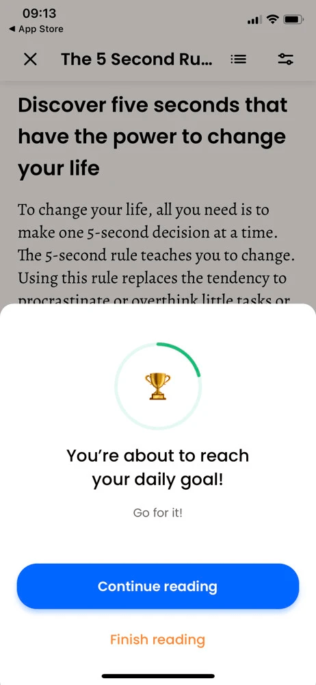
Headway uses bottom sheets to motivate to reach their daily goal
When a Headway app user has an unfinished daily goal, the app uses a bottom sheet to encourage them to maintain their commitment to personal growth and self-improvement.
This contributes to user engagement by providing timely reminders and personalized motivation for the Headway users.
How Headway uses bottom sheets to motivate users to reach their daily goal
Source: Plotline
Driving conversions
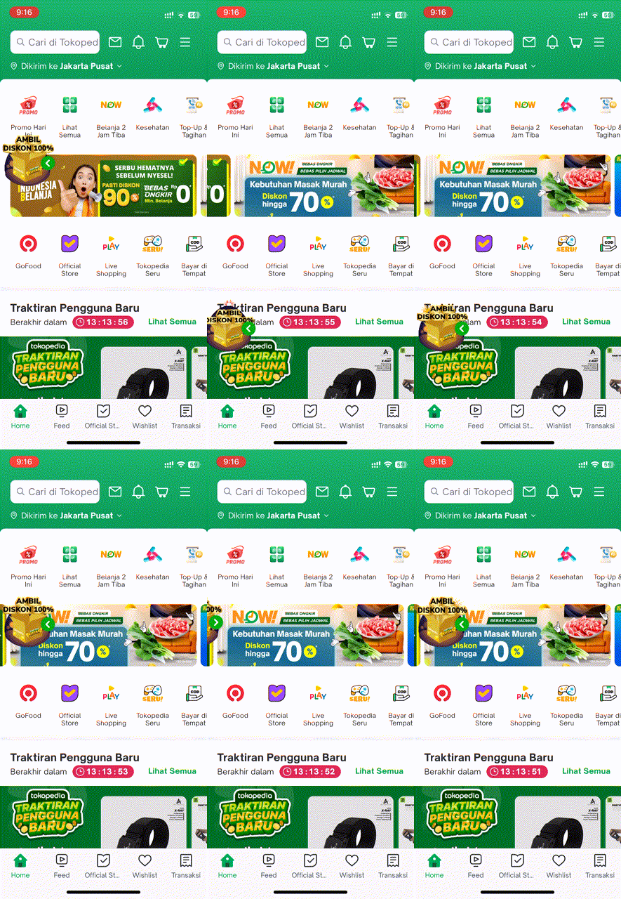
Tokopedia uses a floater to improve monetization
Tokopedia, an Indonesian e-commerce company, runs a floating action button to promote discounts, sales, and other kinds of offers.
This floater is non-intrusive and doesn’t disturb the checkout flow. Such floaters typically get >20% CTRs.
How Tokopedia improves monetization using floaters
Source: Plotline
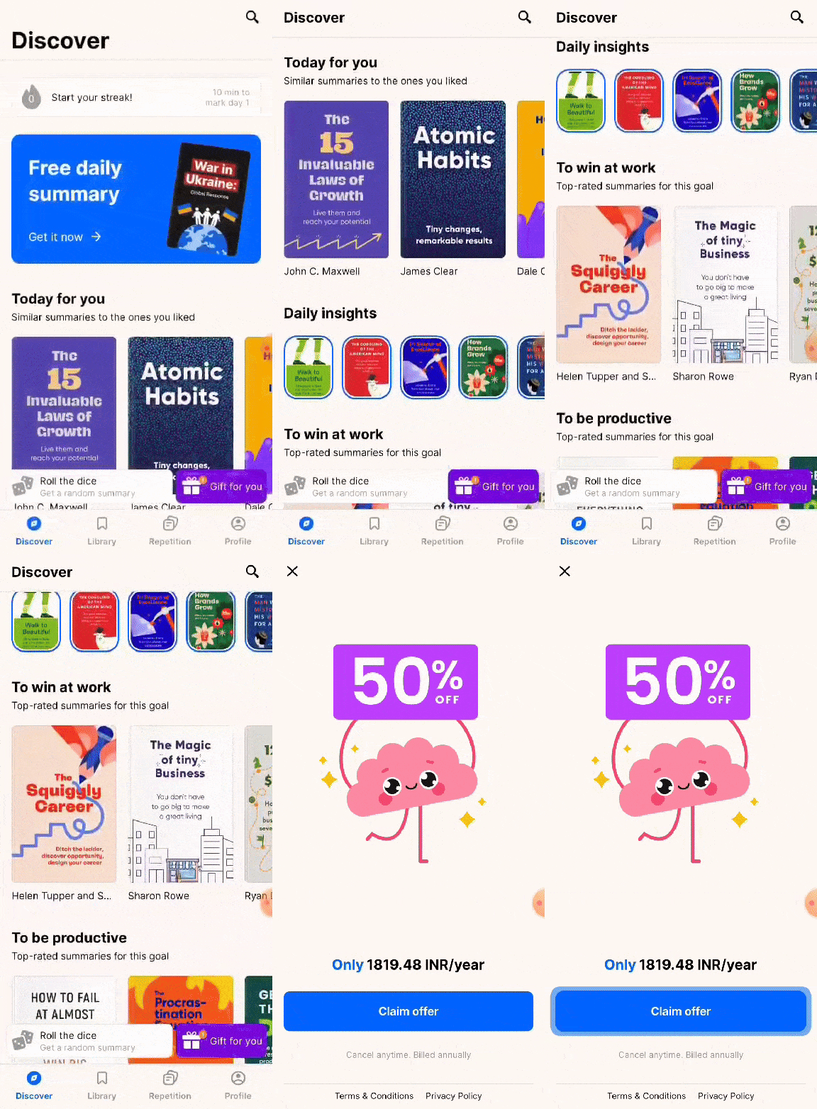
Headway uses a pinned slider to drive conversions
Headway, a subscription-based self-growth app, employs a savvy conversion strategy. During onboarding, a pinned slider featuring an enticing “Gift for you” call-to-action appears above the navigation menu.
This slider guides trial users towards unlocking the app’s full potential by offering an exclusive discount. This banner creates an urgency to convert.
How Headway drives conversions using pinned sliders
Source: Plotline
At Plotline, we’re building an in-app engagement platform to help B2C companies activate, retain, and monetize their users
The next level of growth for consumer internet companies will be driven by real-time in-app user engagement.
Plotline lets you create and deploy customizable in-app campaigns that match your design theme – to drive crucial metrics like activation, retention, and monetization.
If you’re interested in learning more, start a free trial with us.


