The onboarding experience is one of the most important steps in an app’s long-term retention performance. It sets the tone for the ongoing relationship with the user and should be considered similar to entering a store for the first time. Any unnecessary friction can adversely affect user experience as users are highly sensitive when entering an unfamiliar space.
An app which has a value proposition based on something other than the user’s identity can undermine user experience by mandating the registration process in the onboarding journey. Therefore it is vital for app developers to design the onboarding journey while keeping in mind the app’s core value proposition and being wary of any unnecessary friction that may lead users to churn.
This post was first published on phiture.com.
In this guide, we address the role registration plays towards an app’s retention and long-term success, as well as factors that affect mandating the sign-up process, the effects of mandating on both the users and the app developers, and, finally, some cheeky ways to integrate the account sign-up while ensuring a smooth user experience.
What is the purpose of signing up for an app?
Andy Carvell describes the purpose of registration in his article “User accounts: Pros and Cons for Mobile Growth” as a system that allows the user to create an account with an app to uniquely identify with the product. Signing up allows permanence across devices and ensures continuity in experience by signing the user into their account across desktop as well as mobile. Moreover, a user account increases the lock-in factor of the app by functioning as a digital locker to store progress and bookmarked content such as favorites.
Once a unique account with user information exists, it’s typical for app developers to leverage that information to personalize the user’s experience within an app. This can positively impact how users perceive the app as its core value is now even more relevant to them, thereby reducing the reasons to abandon the app.
Before we get to this point, the sign-up experience is a crucial step for user onboarding as it is where we ask the users to provide their personal information without them yet knowing if the app solves their purpose or not. It becomes important for app developers to design the experience so that only the absolute must-have information is asked to ensure a smooth onboarding flow. That said, there are some apps whose core functionality is not affected by user credentials. Therefore forcing users to sign-up in the onboarding journey can obstruct them from getting to the end value quickly. According to a report published by Targeting Mantra, 68% of the total respondents answered “complicated registration process” as the reason for immediately uninstalling the app right after downloading. Therefore, it is necessary for app developers to strike a balance between business needs and user needs while designing the registration experience.
Long-term retention begins with sign-up
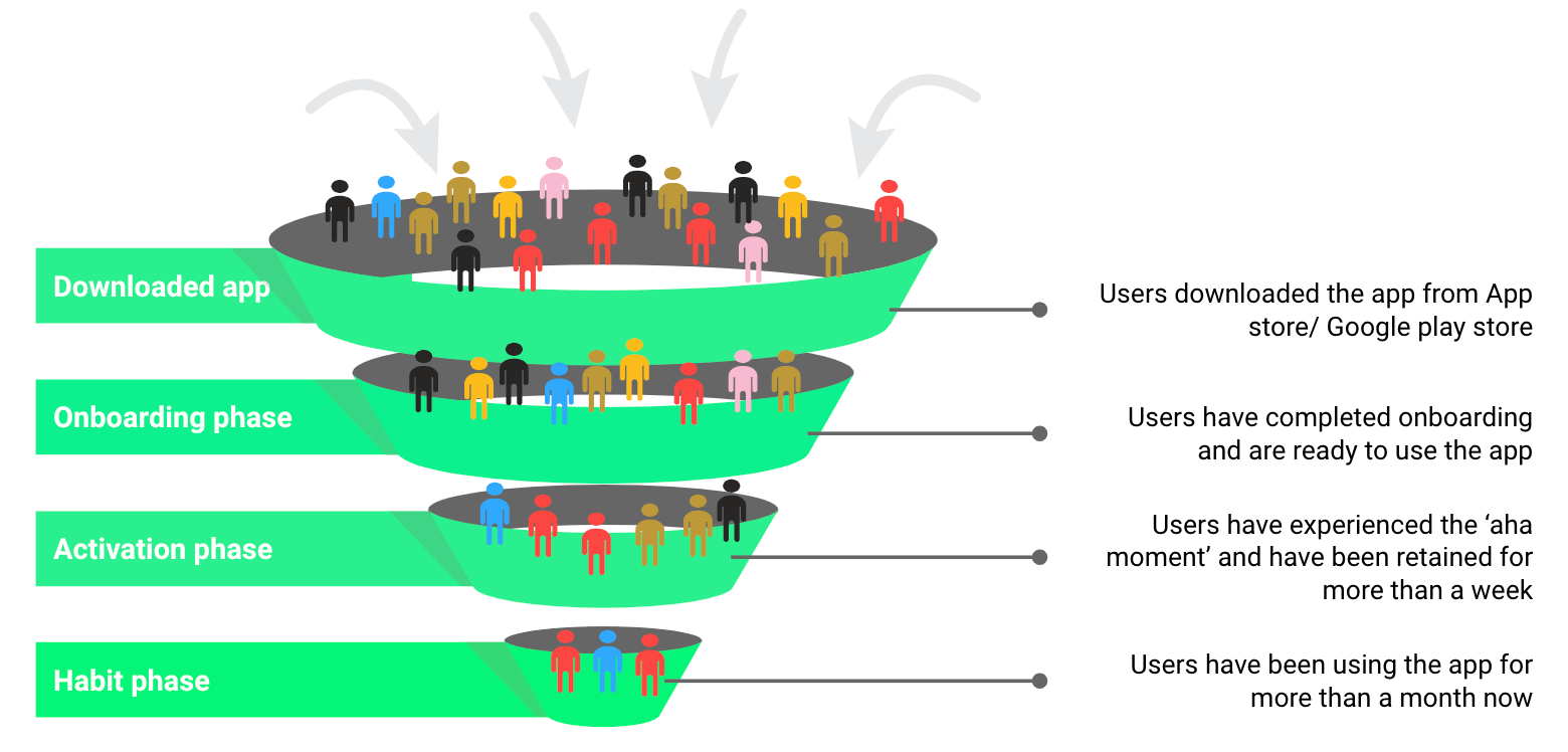
Onboarding starts the moment a user downloads the app. Every step in the onboarding journey represents an opportunity for the app developer to gather information from the user to enhance their experience around the core value proposition. Most of the users who sign up and make it past the onboarding stage flow to the activation phase where they’re activated by experiencing the core value of the app. Out of these activated users, the ones who are now convinced by the core value of the app and have been using it regularly, flow to the habit stage. The proportion of these retained users to all users who downloaded the app determines the long-term retention rate of the app.
Retention funnel
Source: MarketingProfs
What happens if registration is mandatory for all users?
This generally increases friction among users who are reluctant to share their details without knowing if the app solves their purpose, thus leading them to churn.
One way to illustrate this is by imagining you are looking for a shared apartment. You receive an open house invitation to visit a spacious apartment in a desirable location. Unsurprisingly, there are other interested visitors who leave their credentials with the owner to be contacted later, However you are disappointed that the apartment wasn’t suitable to your requirements (can’t play instruments or host friends). You decide not to leave your credentials as it’s not for you and leave. Unlike the experience at the open house, downloading a free app from the digital store mostly mandates the users to leave their credentials i.e., sign up.
🔍 Master Onboarding with JTBD & MaxDiff
Discover how to optimize your app’s onboarding process using the Jobs-to-be-Done framework and MaxDiff analysis.
Download nowThe implementation of a mandatory sign up process should instead be centered around the ‘aha moment.’ If the app’s core value is built around the user’s identity (for example, Facebook or Instagram), registering users should be mandated to sign up. Otherwise, if the app’s purpose is not centred around identity, users should be allowed to temporarily skip logins during the onboarding process so they can see if the app solves their purpose.
Which factors determine the need for mandatory sign-up?
There are certain factors that influence the need of mandating the sign-up process.
Trust/Security
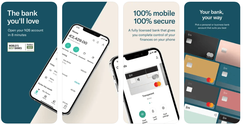
Certain apps require users to create an account to ensure data security and control over information. In such cases, a registered account helps the user trust the product to store sensitive information and integrate it with their daily life. Mobile banking apps such as N26 or Revolut mandate their users to register to ensure safety with regards to financial transactions and other personal information.
Example of N26 value proposition to creating account to ensure data security and protection
Source: Phiture
Personalization
Apps such as Facebook/Instagram have a universal sign-up process, which is similar across multiple users but the app’s core value (feed posts) differs drastically for all the users. This is mostly because Facebook/Instagram’s core value thrives entirely on personalization as it promises to deliver unique value to its users based on their preferences, interests, and community. In such cases, an app requires its users to create an account to personalize their experience based on their friends’ activities, groups they might be interested in, trending hashtags etc.
Example of Facebook’s value proposition based on user’s friends
Source: Phiture
Commitment
The process of creating an account requires an investment of effort. The core value of certain apps revolves around users committing to a certain behavior to achieve the goals in the app. Apps such as Headspace mandate their users to create an account to monitor progress in achieving their goals as part of the app’s unique value proposition, (in Headspace’s case, meditation).
Consistency
Most of the apps that we see on the app stores are designed to imitate the functioning of a physical product/service in a digital environment. Hence, it is necessary to maintain the user’s experience to be as consistent as possible with the offline world so as to enhance acceptance and drive usability.
For example, consider going to buy groceries at the supermarket. You step inside the store, choose your items, pay and exit. Nowadays they also have a self check-out counter where you no longer have to interact with the checkout operator and can personally scan the product barcodes, pay and exit. Now, for a grocery app to be successful and to be widely accepted across different user groups, it needs to provide a buying experience similar to that of a self checkout, that’s efficient, frictionless and less intimidating.
Buying frequency
For a product or service that a consumer is unlikely to demand frequently, such as a mattress, there will be resistance among users who don’t wish to invest the effort in registering to order, and, as a result, will churn immediately. For such products or services, an option to skip registration and checkout as a guest can reduce friction in the purchase process and help users convert faster. Apps such as Ikea allow their users to checkout as a guest to complete an order.
Core value proposition
For some apps, the end value can only be experienced when the data is explicitly provided by the user. Mobile wallet apps such as Stocard allows its users to add, store, and organize all their loyalty/reward cards in one place. All users have to do is to create an account, scan their card’s barcode, and the app will create digital copies of their loyalty cards that can be redeemed later.
Example of Stocard value proposition based on user’s loyalty/reward cards
Source: Phiture
How to integrate sign up into a smooth user experience
Kevin Indig in his article “Why product market-fit is so important for Growth Marketing” compares an aha moment to meeting an attractive person and realizing you’re attracted towards them”. When comparing this moment to a product, attractiveness can be conceptualized as the app’s core value, and thus it becomes important for a growth marketer to design the sign up process in a way such that the app’s attractiveness is unaffected. Here are some clever ways to make users sign up while ensuring a smooth aha experience:
1. Rewarding user actions to complete signing up: For apps supporting virtual currency, rewarding users to complete sign up can drastically enhance conversion. Apps such as Habitca reward their onboarded users with the chance to win virtual points that can later be used to access premium features in the app, when they update their profile..
2. Providing clear utility to sign up: Users are reluctant to share personal information in an app unless there’s an immediate pay off. Providing clear reasons for signing up such as exclusive discounts can enhance conversion and ensure users understand the value of creating an account within the app. Food delivery apps such as Doordash offer its registered mobile users 50% off on their first order + 0$ delivery fee, giving their users an incentive to sign up instantly.
3. Using social logins for quick sign up: Using social logins facilitates a leaner signing up experience and eliminates the hassle of remembering multiple passwords for the app. This also benefits app developers as it provides access to more user data points that can later be used as levers to segment user groups. Apps such as Canva allows its users to login socially with Google, Facebook etc. to jump start their onboarding and get to designing graphics in just 2 clicks.
Example of social logins for quick sign up to get started with Canva
Source: Phiture
4. Moving sign-up process to later in the user journey: The concept of gradual engagement has become quite trendy recently in the app’s ecosystem. According to the concept, the sign-up process can be postponed after the user has experienced the aha moment and is convinced that the app solves their purpose. Language-learning app Duolingo does this perfectly by allowing the user to complete a language lesson without prompting them to register.
Example of Duolingo allowing users to complete a lesson before signing up to save progress

Source: Phiture
5. Having users sign up to access exclusive features: There are apps that allow users to experience the core value without asking them to sign up but restrict their access to limited features in the app. This gives the user an opportunity to explore the app and sign up only to access other features. Apps such as Tiktok allow users to experience its feed, while restricting certain features to account holders only.
6. Guest checkout: Mostly suitable for lower frequency products, guest checkout reduces the friction involved in the purchase process and increases order conversion rate. As mentioned, Ikea speeds up the checkout process with a guest option and allows its users to make a purchase without creating an account.
Wrap up
To summarize, mandating the registration for users depends entirely upon your business model and how you would like to shape your app’s core value experience. If your app’s core value depends highly on user information, it’s recommended to sign up users early in the onboarding journey otherwise sign up can be delayed or tweaked later in the user journey if the app’s aha experience is not affected by users’ personal information.
This is first in a series of three articles that will be released later in the year about rethinking the onboarding process from a retention point of view. The next article will cover the principles of bias and heuristics that influence users’ psychology to sign up.


