Getting people to open your app is an obvious win, but keeping them there while delivering important contextual information is where the true victory lies.
In the age-old conversation of acquisition versus retention, we know retaining users is significantly cheaper than scouting new ones. In-app messaging allows mobile platforms to effortlessly communicate with their users based on highly personalized messages as well as drive permission access to support push notifications. Think of in-app messages as the seamless gateway between your app’s most critical information and your users’ everchanging attention spans.
This post was first published on onesignal.com.
In-app messages can improve app retention rates by 27% and we’re going to walk through some of the most impactful use cases where they can make the biggest splash within your messaging strategy. Use each one of these as app inspiration, marketing ammunition, or simply some great reminders of just how effective in-app messaging can be for driving app engagement.
App onboarding
For many apps, the most important touchpoint is the first touch. In fact, “important” is an understatement. The onboarding process is the make-or-break period (and very first impression) you will make with new users during those crucial first few moments on your platform. Establishing an instant emotional connection while educating newcomers on how to navigate your app through in-app messages has been proven to reduce app installs by up to 25% in the first month.
Let’s see it in action.
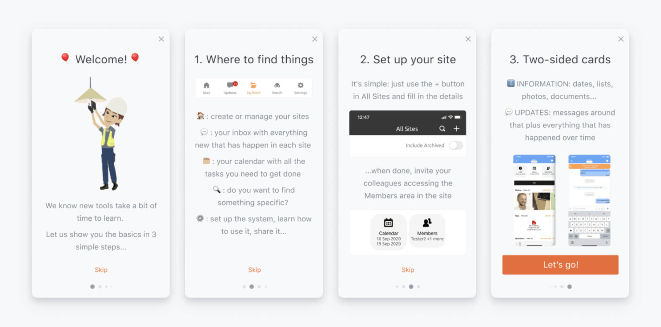
Construction management app Ogun specializes in facilitating and coordinating for contractors and renovation experts. It’s essentially a unified hub for construction teams to keep their projects and communication all in one place.
By utilizing an in-app messaging carousel, Ogun not only built out an intuitive welcome message but a series of custom welcome cards designed to progressively engage new users with all the necessary functionality they need to navigate their app with ease.
Remember, onboarding enables user success — and a user who feels successful on your app is one who will stick around to recapture that feeling.
Ogun’s onboarding carousel
Source: OneSignal
Key takeaways:
- Under five slides. Your onboarding should be comprehensive enough to explain basic app functionality but not so long that your new users’ eyes start to glaze over.
- The option to skip. On the note of attention span, some newcomers may be savvy enough to get started immediately – give them a path of least resistance to your app.
- Appeal to visual learners (that’s most of us!) Don’t make people read a novel – break things up with emojis or example images to keep all eyes on the prize (your app’s value proposition)
The best part? It worked. After proactively optimizing their onboarding pain points with the above welcome flow, Ogun saw an immediate 80% increase in CTR for their onboarding messages using OneSignal’s Carousel feature. To read more about how Ogun reduced churn with new in-app messaging, read the case study here!
AdTech is changing — it’s time to find out how
AI, privacy shifts, and new monetization models are transforming the app industry. Learn more about these changes and other app marketing insights in the AdTech Trends 2025 Playbook by Yango Ads.
[Download Playbook]Permission prompting
Getting permission to send users push notifications is nowhere near as easy as it used to be. People have dozens of apps on their phones, many of which they don’t frequently use. If you are going to ask for permission to ping your users’ devices, you better have a good reason and be willing to share it with them. In-app messaging provides a perfect opportunity to “pre-prompt” users with the helpful context necessary to justify push notifications or SMS notifications before they see the generic native prompt on iOS or Android. In short, this is invaluable real estate to tell your users how enabling push notifications will improve their experience.
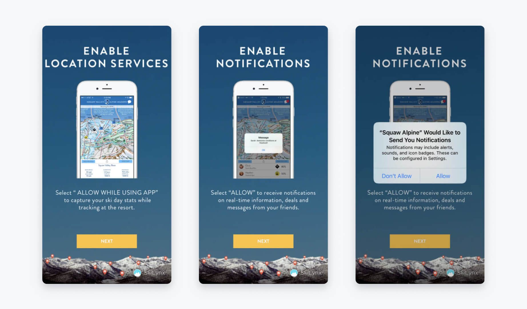
A great example of this is Palisades Tahoe app’s pre-prompt structure. Palisades Tahoe is a ski resort app that helps skiers track their ski days, monitor lift statuses, and connect with friends. Their in-app pre-permission prompt message encourages users to allow notifications BEFORE the native iOS permission prompt is triggered.
Palisades Tahoe’s in-app pre-permission prompt messaging
Source: OneSignal
Key takeaways:
- Justify, justify, justify. By explaining the “why” behind asking for push permissions (“capture your ski stats,” “real-time deals,” “messages from friends”) these in-app messages make a solid case that they won’t merely be pestering you with irrelevant notifications.
- Everything, upfront. Palisades Tahoe demonstrates a need for both location permission and push notifications to get the most out of its app.
- Two-step. Notice that the native iOS permission prompt appears immediately after the app’s pre-prompt sequence. It’s important to make it clear that, although you are explaining why users should allow notifications, they still must select “Allow” on the official prompt to seal the deal.
For a bit of added nuance to your in-app messaging strategy, OneSignal offers detailed in-app messaging segmentation features which allow for prompting users based on specific time triggers like single session time or total number of sessions.
Creating pre-permission prompts via in-app messaging can be a quick, no-code way to bolster opt-in rates for notifications — just don’t force it, and don’t expect your users to select “Allow” just because you asked. Help them make informed decisions based on how your app improves their life.
User surveys
Collecting user feedback is the most direct way to gather insights to help improve the user experience, address churn-inducing pain points, and improve user lifetime value (LTV). Don’t rely on email to gather customer feedback – most people are not in the right headspace to set aside time for surveys when they’re trying to clear their inboxes. However, when someone opens your app, you have their most undivided attention meaning they are much more likely to share feedback while your platform is top of mind.
Rather than forcing users to think about your app when their minds are elsewhere, in-app surveys catch them when they are already thinking about (and actually using) your app.
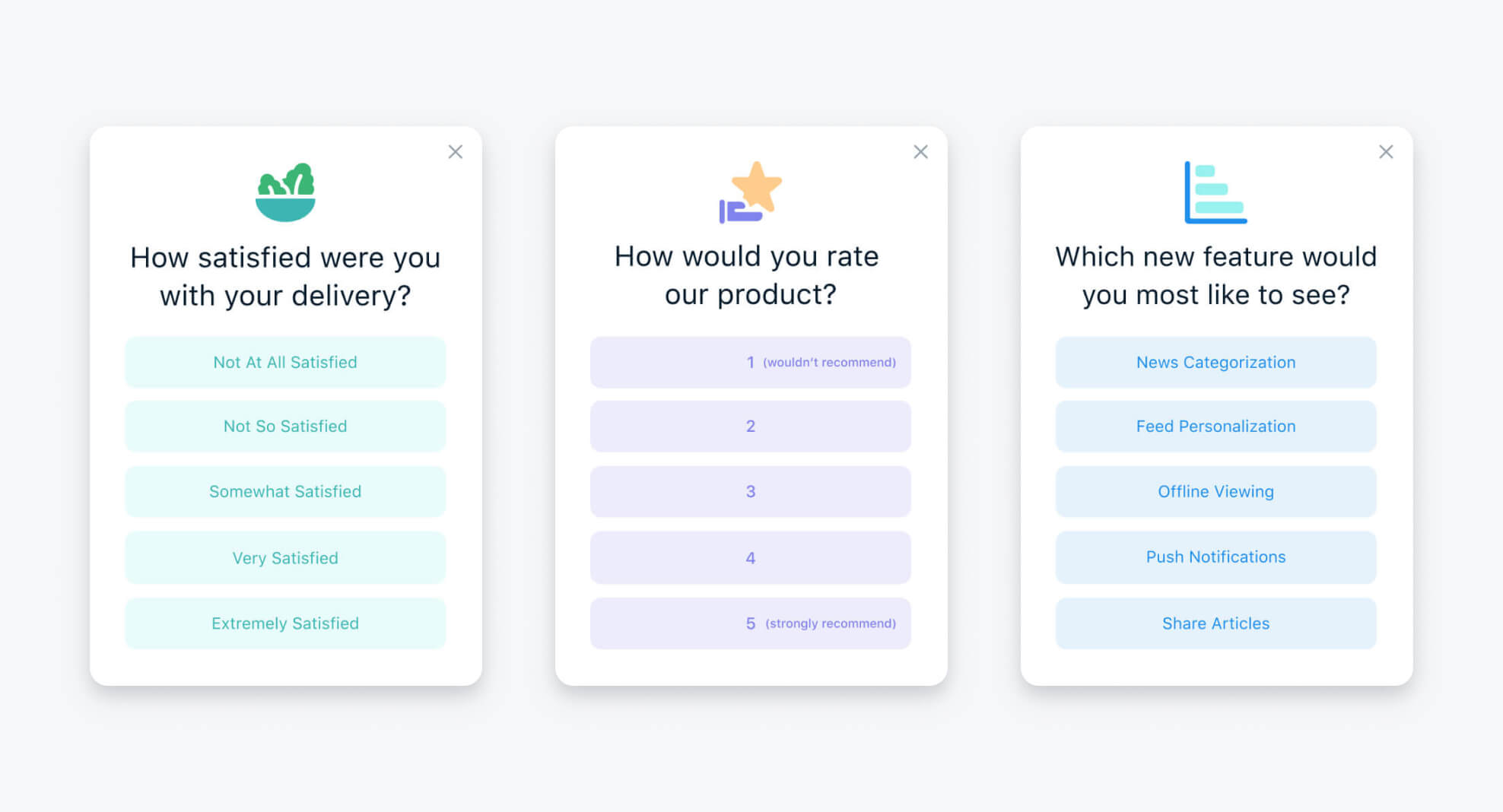
Example of an in-app user survey
Source: OneSignal
Key takeaways:
- Crystal clear. If you are using a number-based rating system, leave no doubt in the minds of your users which option signifies “strongly recommend” or “would not recommend.”
- Get the forecast. Remember, in-app surveys are good for more than just collecting insights on existing features. Ask your audience which new features or tools they would like to see implemented in the future. Is the winning topic something your team can easily implement next quarter? Everyone loves a crowd pleaser…
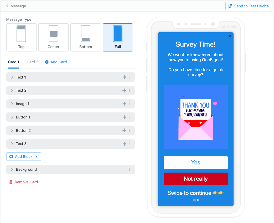
It doesn’t matter if you’re a marketer or developer, reducing user friction should always be a top priority. In-app messages allow you to embed your customer surveys directly into your app, giving users both a relevant context for a feedback request and increasing the chances of collecting quality data to use for feature improvement.
OneSignal’s in-app carousal editor
Source: OneSignal
Take OneSignal’s in-app carousel editor, for example. Create up to 10 pages of questions, all with multiple-choice answers and a variety of placement, color, and image options. After your users complete the survey, OneSignal collects the results and allows you to group the responses using Data Tags for future targeted messaging.
User education
One of the most common reasons that users churn is because they either misunderstand the core functionality of your app or they simply can’t figure out how to use it outright. This is especially true with new newer technologies or apps that hit the charts within emerging industries.
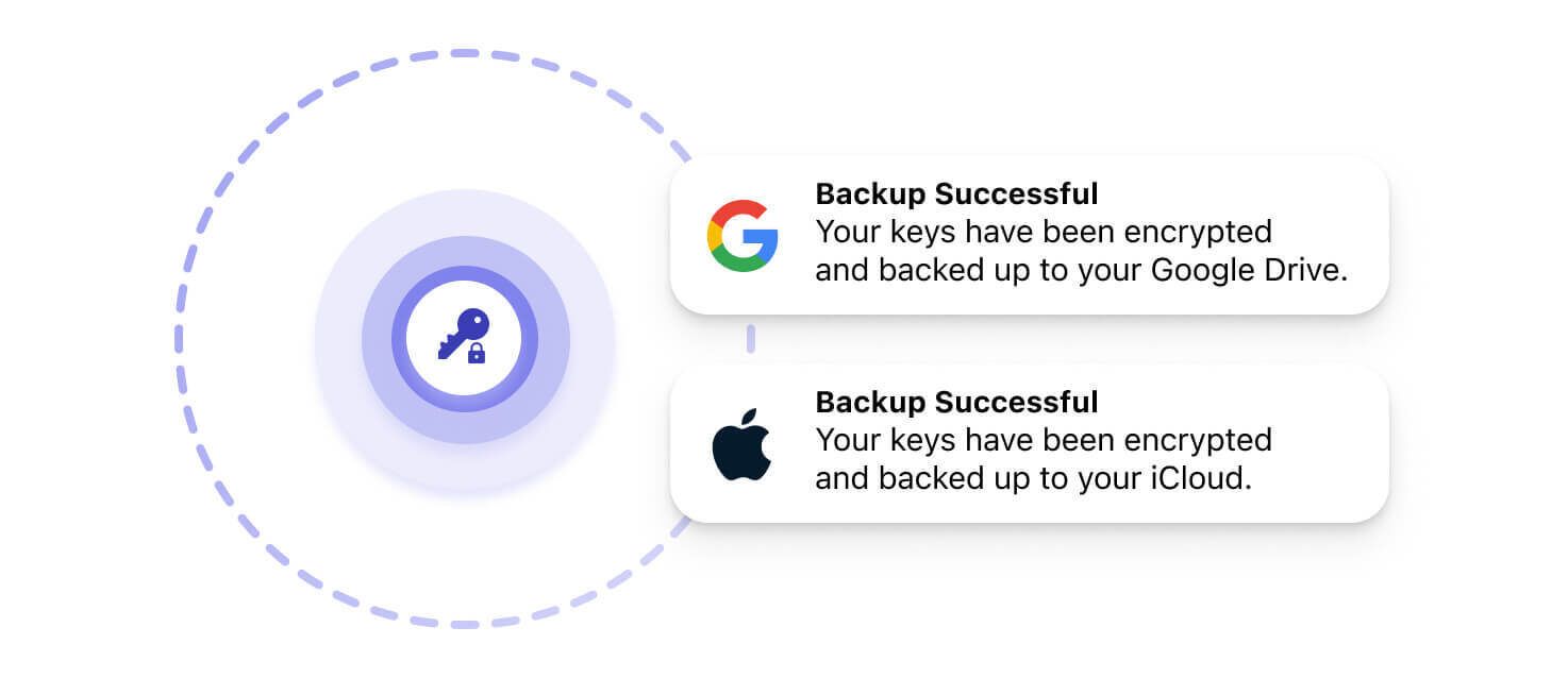
A perfect example of addressing this mobile user education challenge is Bitcoin.com. The popular financial services platform and cryptocurrency wallet provider was looking for a way to inform and educate their users about the benefits of their cloud backup service.
Cloud backup education by Bitcoin
Source: OneSignal
The feature was designed to give users greater security in the event that they lose their device or forget their wallet key. Because this feature must be activated from within the app, in-app messages were able to make a direct impact in reaching users and prompting action while users were engaged.
Additionally, Bitcoin.com used in-app messages to address common hiccups in the user experience and provide case-by-case “remedies” designed to reach specific user segments and educate them on the best way to enhance their experience.
As Daria Dovzhikova, Bitcoin.com Growth Product Manager, explains, “We’re constantly meeting with the customer support team. For instance, if I get information that some users experience the same problem over and over and that problem is common for different cohorts, then we can send an in-app message to educate the user so that they don’t make that same mistake again.”
Sharing rewards and promos
Rewards and promotions are some of the best ways to keep users incentivized and feeling a sense of accomplishment for engaging with your brand. Certain apps, particularly mobile games, benefit from the inclusion of in-app messaging as a way to convey exciting deals or in-game rewards designed to keep players engaged.
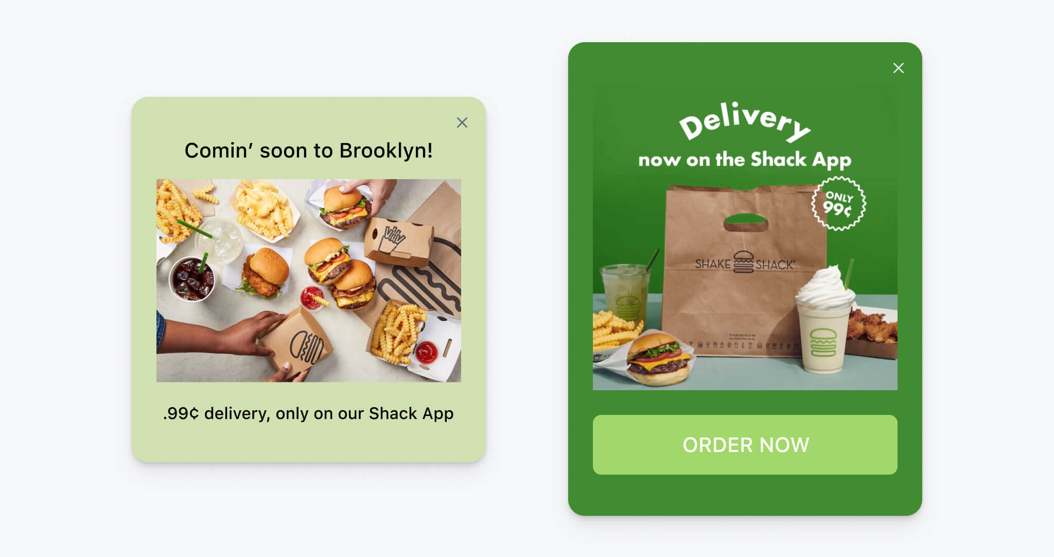
A great example of a brand building anticipation through in-app messaging is Shake Shack. After working with OneSignal, Shake Shack leveraged both push notifications and in-app messages to promote a limited-time Superbowl offer with an “order now” call-to-action button. The result? 37 thousand impressions and a 20% click-through rate!
But they didn’t stop there. During the pandemic, Shake Shack was looking for ways to embrace the growing demand for digital and distanced lifestyles. They wanted to incorporate order pickup and delivery services into their mobile but because delivery logistics vary from city to city, they needed a way to test those different markets.
Promotional in-app messaging by Shack app
Source: OneSignal
The solution? Target densely populated city centers (like New York and Chicago) using geolocation data. As Shannon Reilly, Shake Shack CRM Manager, explains, “We would target certain metro areas to let them know the feature was launched in order to boost adoption and generate excitement.”
Interested in seeing how Shake Shack grew their subscriber base by 184% using OneSignal cross-channel messaging? View the full Shake Shack Case Study!
Updates and alerts
Many mobile app verticals require their users to be in the know around the clock. From sudden price changes on a fintech app to itinerary updates through a travel app, there is just some information that cannot wait for the next email blast. In-app messages can bend to fit almost any form of update or alert notification:
- Notify users about updates. In-app messages notify users about the availability of app updates. This is a great way to drive awareness and encourage users to keep their app version up to date by learning about new features, bug fixes, performance improvements, or security patches.
- Highlight important changes. Have you recently redesigned your user interface or added a new core feature? In-app messages are a perfect place to include visuals, descriptions, or even short videos to showcase the changes and explain their benefits.
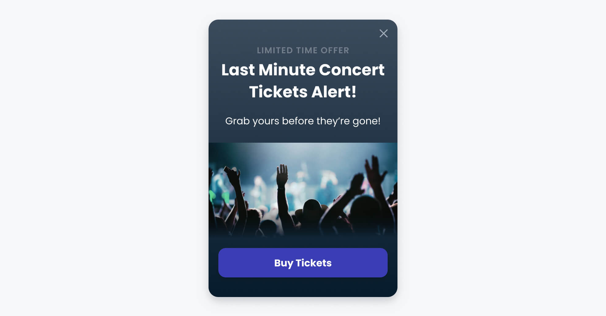
- Urgent alerts and critical notifications. Some messages are time-sensitive in nature and require users to take a specific action with their account. For example, if there is a security vulnerability, service disruption, or important system maintenance scheduled, you can use in-app messages to inform and advise users about the situation.
Example of limited offer alert
Source: OneSignal
By leveraging in-app messaging for mobile app updates and alerts, you gain the ability to communicate changes, engage users, and maintain a positive user experience through unexpected circumstances. These messages ensure that your users are well-informed, increase the adoption of new updates, and foster a sense of transparency and responsiveness between you and your users.
OneSignal makes in-app messaging easier than ever
In-app messages represent one of the most powerful ways to improve user experience and support retention, all without giving away the one thing all mobile apps need to survive: user attention.
Designing custom in-app messages for every use case has never been easier than it is with OneSignal. Our platform unifies your user communication across various channels, including in-app messaging, mobile push notifications, web push notifications, bulk SMS, and email. At OneSignal, we’ve built our reputation on giving businesses of all sizes the ability to easily set up in-app communication and to allow for as much (or little) customization or automation as you see fit. Experience it firsthand by trying OneSignal for free and see what the buzz is all about.


