People stop using apps due to unmet expectations and poor user experience – but you can work on improving them. Here, we present you with 4 tips on mobile app UX/UI optimization. Find out what effect poor UX has and how to avoid those pitfalls.
As much as 53% is the average app uninstall rate after 30 days, as shown in the AppsFlyer report for 2020 – and for the first day after downloading an app, it’s 45%. Similarly, Statista’s research proves that every 1 out of 4 apps is used only once. All of this gets reflected in financial metrics: from costs of acquisition to the customers’ lifetime value.
So, why do people stop using the apps they download?
In a sentence: apps don’t meet the users’ expectations. Let’s dig deeper, as this generic statement won’t help you improve your situation. CleverTap conducted a survey asking about the reasons for apps being uninstalled. “Not in use” was the main reason with 40% of the answers, followed by “Limited space” and “Excessive advertising” with roughly 19% and 16%, respectively.
Together with other reasons for uninstalling such as – confusion, technical issues, excessive notifications, they all point to a poor user experience.
Mobile app UX vs. UI – what’s the difference?
If you use those terms interchangeably, it’s high time to highlight the difference. Mobile UX, or user experience, is everything that impacts a subjective experience a user has with your app. It can be content, interactions, navigation, the way information is introduced, and many more elements.
Mobile UI, or user interface – it includes all the graphic elements or what the user sees. While closely related to the UX, it focuses on a more specific area. UX is a broader notion and includes UI as one of the particular aspects of how an app works.
Mobile app optimization – 4 tips
Tip 1: Check what you promise – and what you deliver
As a high uninstall rate points to the difference between user expectations and your app, you can start by contrasting the two. It can feel like a challenging task, but it’s a necessary part of the process. By doing this, you’ll find out what to focus on so that you can live up to your users’ expectations.
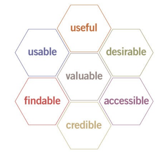
Start with purely technical issues, like loading speed, errors, and reliability. Then, analyze the user experience. Peter Melville prepared a UX honeycomb with the essential characteristics of a good design:
Does your app fulfill them all?
When talking about a reality check, it’s helpful to learn how your app works in action. Learn who uses your app and how. Here, user behavior analytics may come in handy – head to tip #3 to learn more. You can discover a specific group that enjoys and needs your app, and you should adjust your marketing efforts accordingly.
Tip 2: Cut out the clutter from your mobile app design
When you design your app, you surely take into consideration the technical capacity of a regular device. Have you given the same thought to the cognitive load, or, in other words, how much brainpower does your app need?
Usually, you won’t have your users’ full attention. There can be many reasons for lower capacity: they’re watching a movie, commuting, cooking a meal, thinking about other stuff, or just being tired after a long day. Apart from that daily load, your users can have attention deficits, visual impairments, or belong to another group with special needs. Also, the use of mobile apps by the elderly grows each year, and your design should take their needs into account. Remember, keep accessibility at the forefront of your mind while designing.
Take a close look at your design. Does each text, button, or option support users in their actions? Is it clear what to do next? When you show too many options on one screen, your users need to take more thought in making decisions, and they can even face choice paralysis – known as the paradox of choice. As the Nielsen Norman Group claims, simplicity wins over an abundance of options: don’t make it hard for your users.
Tip 3: Base your decisions on user behavior data
User behavior data is crucial to understand your user base needs when optimizing your mobile app UX. Imagine you can observe how all your users are interacting with your product – and not just a limited testing group. Session recordings and event analytics give you that opportunity.
Smartlook is a user behavior analytics solution that works both for websites and native mobile apps. You can get all the context to situations like conversion, abandonment, uninstalling, or other crucial actions that your users perform. It gives you an insight into what’s hidden behind your metrics – and if you’re just starting with mobile app KPIs, check out our guide.
Tip 4: Review the users’ tasks
And make them more accessible. When your user behavior data shows you that users abandon tasks quickly, look for a root cause. Maybe you ask for too much data input? Perhaps you should divide them into smaller chunks? Or, when offering a choice, make use of the previously gathered data to suggest some intelligent solutions?
After you introduce changes in the UX, your analytics tool will show you their impact. In Smartlook, you can observe it in event funnels: a feature that shows you how many users complete a particular path. In this way, you can assess whether it serves your users well or if it needs further improvement.
Final words
Mobile app UX/UI optimization is one of the most critical processes for any app development team. It won’t be a one-time action. Even when you reach the level you wanted, you should still keep an eye on your user base changing their needs.
Nevertheless, when investing your resources wisely, you’ll notice an increase in your conversion rate, user satisfaction, retention, and ultimately financial success. With a user behavior analytics tool, you’ll have direct access to in-depth insights right at your fingertips.


