Almost all users will eventually land on your app product page before downloading it. Whether they clicked on a social media ad, were redirected from a mobile web page, or searched directly in the app stores, your customers will surely have to navigate your app product page to install your app.
Effectively optimizing your app product page can have a major impact on both your organic and paid UA strategies. In this guide, you’ll find everything you need to know about optimizing your app store product page for the App Store and Google Play.
Introduction to App Store Optimization
What Is an App Store Product Page?
Performance marketers are shifting budgets to Browser Advertising 📈
Learn how brands like Walmart, Expedia and Nike drive incremental growth by reaching high-intent users before they hit search.
Get Your Free GuideA store product page is the landing page of a mobile app or game released on the App Store or Google Play. On this page, users find information describing the app’s features and functionalities. An app developer or mobile marketer can customize this page to add an app title, description, screenshots, and many more elements with the aim of convincing the audience to download the app.
This may sound easy at first, but competition in the app stores is very high. To increase your app’s visibility and make your app stand out, you have to carefully optimize each element of your app product page.
Keyword Optimization vs Conversion Rate Optimization
App product pages need to be optimized not only for conversion but also for discoverability. When users search for an app, the stores return a list of apps based on several factors, including user behavior (e.g. the number of downloads an app has, or its ratings and reviews) and textual relevance (how well the app title or description matches the user’s search query). This means that correctly optimizing your app’s textual metadata elements can impact your ranking and help users find your app.
App Store Optimization Buyer's Guide
Download our App Store Optimization Buyer’s Guide, covering all aspects of this essential app marketing technique to drive native traffic to your mobile app.
App Store Optimization (ASO) can be divided into two big pillars – keyword optimization (KWO) and conversion rate optimization (CRO).
- Keyword optimization: The goal of KWO is to increase an app’s visibility in the search results. It involves researching, analyzing, and selecting the best keywords to include in an app’s title, subtitle, keyword field, and long description.
- Conversion rate optimization: The goal of CRO is to convince store visitors to download your app. CRO is the systematic process of adjusting the textual and creative elements of an app’s product page to ensure that the highest possible percentage of users download the app after seeing it in search results or after visiting its product page.
These two pillars work closely together. A solid keyword optimization strategy will result in higher rankings, while solid conversion rate optimization efforts will make sure this increased visibility leads to more app downloads.
App Store Conversion Rate
Before you start optimizing your app, it is important to set relevant goals and key performance indicators (KPIs) to measure its success over time. When it comes to optimizing the different metadata elements of your app product page, the conversion rate will be one of the main metrics to keep a close eye on.
There are two types of metrics to consider when analyzing your store conversion rate:
- Conversion rate: The percentage of users that download your app after having viewed your app page. This metric is mostly used across the ASO community to better understand how well your page convinces users to download your app after they have viewed or tapped through to your page.
- Install rate: The percentage of users that download your app directly from search or browse results without tapping through to your app page. The install rate tells you how well your app stands out in the store search results.
| Expert Tip Between January 1, 2021, and October 31, 2021, the average conversion rate in the US was 30.3% on the App Store and 33% on Google Play. However, these averages vary widely between different categories. |
Differences Between the iOS and Android App Page
Although app product pages on the App Store and Google Play serve the same purpose, there are a few important differences to be aware of.
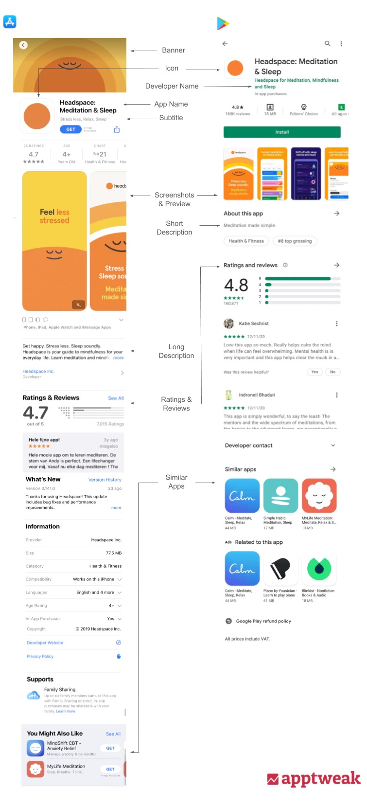
An overview of what the app product page of Headspace looks like in the Apple App Store vs the Google Play Store.
Here is a quick recap of the main differences between an app page on the Apple App Store vs Google Play Store:
| Apple | ||
| Banner | Only shows for certain apps at the top of the page. | There is no option to add a banner. |
| App Icon | Easily visible at the top of the app page and in search results. | Easily visible at the top of the app page and in search results. |
| App Name | 30 characters. Shows next to the icon at the top of the app page and search results. | 30 characters. Also shows next to the icon at the top of the app page and search results. |
| Developer Name | Shows underneath the app title on the app page, but automatically displays the subtitle after a few seconds. Also shows in the information panel on the app page. | Readily visible and shows underneath the app title in search results and on the app page. |
| Subtitle or Short Description | 30 characters. Shows underneath the app title in both search results and on the app page. Is usually cut off at 26 characters. | 80 characters. Shows underneath the screenshots on the app page. When using portrait screenshots, the short description will usually be shown below the fold. |
| Information Panel | Displays total number of ratings and average star rating, age restrictions, category ranking, developer name, languages in which the app is available, and size. The information panel displays above the screenshots and users need to scroll through it horizontally to see all the info. | Displays total number of ratings and average star rating, total downloads, and age restrictions. The information panel displays above the install button and screenshots. |
| Screenshots | Either portrait or landscape screenshots can be added. Portrait screenshots take up most of the space and push the first few lines of the long description down below the fold. Up to 10 screenshots can be added in total. Specific size requirements to be followed. | Portrait screenshots display smaller and narrower on Google Play. Google specifies a minimum dimension of 320px and a maximum dimension of 3840px for screenshots. Google also recommends adding at least 3 landscape screenshots for games and at least 4 screenshots for apps. Up to 8 screenshots can be added. |
| Video | Up to 3 preview videos can be added. Videos can be either in portrait or landscape mode and are usually shown in the carousel before the screenshots on the app page and in search results. | Only one promo video can be added to the store listing. The video appears in the carousel before the screenshots on the app page. It is recommended to add a feature graphic that will serve as an overlay for the promo video. |
| Long Description | 4,000 characters. The first three lines are shown underneath the screenshots. To read the full description, users have to click the “learn more” button. The keywords in the long description are not indexed in the App Store. | 4,000 characters. No longer visible on the app page. Users need to click on the arrow icon next to the short description underneath ”about this app” to read the long description. |
| Keyword Field | 100 characters. The keyword field is not visible on the app page, but Apple does index the keywords added to the keyword field. | It is not possible to add keywords to a keyword field on Google Play. |
| Promotional Text | 170 characters. Appears above the long description. Keywords used in the promotional text are not indexed. | Google Play does not provide a specific promotional field. |
| Ratings & Reviews | Appear in the search results underneath the subtitle and on the app page in both the information panel and lower on the page underneath the long description. | Appear in the search results underneath the title and on the app page in both the information panel and lower on the page underneath the long description. |
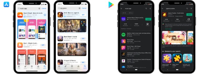
The search results are also displayed differently in each store. On the App Store, apps appear in the search results with the app name, subtitle, icon, and screenshots or video. But since iOS 15, screenshots don’t show anymore if you have already downloaded the app. On Google Play, apps usually show in the search results alongside the icon and app title only. Screenshots will only show for branded searches. This difference shows how important it is to optimize an app page for each store individually.
Search results on the App Store (left) vs Google Play (right). On the App Store, apps appear in the search results alongside the app name, subtitle, icon, and screenshots. On Google Play, the search results differ for generic vs branded searches.
Some of the differences in the store product pages are also related to the methods used by each algorithm. The Android algorithm considers keywords added to your title and description to decide which apps to show in the search results. The iOS algorithm does not index keywords added to the long description and instead allows developers to add keywords to a hidden keyword field.
Expert TipOne of the main differences between keyword optimization on the App Store and Google Play is keyword density. Similar to SEO, carefully repeating your top target keywords in your title, short description, and long description helps Google better understand what your app is about and which keywords to rank your app for. On the other hand, Apple does not account for keyword density. Therefore, it is recommended to not repeat keywords in the title, subtitle, and keyword field. |
How to Optimize your App Store Product Page?
Learn how you can optimize your app page to impact search result rankings and help users easily find and download your app.
1. Promotional Artwork / Banner (iOS)
When an app is about to be featured, App Store Connect asks that specific app to upload an additional visual asset. This visual asset will be used to promote the app’s featurings and stories on the App Store. It will also appear on the app’s product page, right above the app title.
Once you have added the promotional artwork or banner to your product page, it takes up extra space and pushes the rest of the metadata down, thus modifying the appearance of your screenshots. So, the audience will need to scroll down to be able to completely see your screenshots. Therefore, you should adapt your screenshots accordingly. For example, if you have an important caption at the bottom of your first screenshot, be aware that this will not immediately be visible.
Promotional artwork will continue to remain on your app’s product page even when the featuring is over and cannot be modified. Therefore, make sure that your promotional artwork is well-designed and relevant throughout time.
2. App Icon
An app’s icon is one of the most visible elements in store browse and search results. Optimizing your app icon provides store visitors with the best first impression and makes your app stand out from the competition.
Remember, app icons should be more than just logos. A great app icon is simple, memorable, recognizable, and helps to explain what your app is about. Keep the following tips in mind when designing your app icon:
- Only concentrate on one feature or benefit; clarity and simplicity are key. Make it easy for the store visitor to understand what your app is about.
- Utilize the full asset space. Design your icon on a square grid and avoid using transparent backgrounds.
- Avoid using text. Remember that app icons are displayed relatively small on the app stores and small fonts can be hard to read. Incorporating text also presents challenges when you want to localize your app for different countries.
- Use vibrant colors. Choose one or two main colors and play with shadows and gradients to create contrast.
- Design for dark mode. Make sure your icon will stand out in search results for users who use their mobile devices in light and dark mode.
👉 More tips on how to design an eye-catching app icon
Recommendations for the App Store:
On iOS, the goal is to create an eye-catching visual asset that aligns well with your brand and your app’s main functionalities.
Recommendations for Google Play:
On Google Play, the app icon is the only graphic asset that appears in the search results for generic keyword searches. When designing your icon for Google Play, try to be as descriptive as possible without overwhelming store visitors.
Google Play search results are also more crowded, so make sure your icon is unique and helps your app to stand out from the competition.
While deciding on your app icon for Google Play, adhere to the following guidelines announced by Google:
- Google prohibits keywords that suggest store performance in the app icon.
- It is also strongly recommended not to use graphical elements in the app icon that may mislead users about your app (e.g. don’t use text to encourage installs or promote deals).
- Neither does Google allow the use of emojis, emoticons, or repeated special characters in the app icon.
Use Google Play experiments to test several icons and discover which one best converts store visitors into customers. You can also use AppTweak to monitor your competitors’ A/B tests and learn what works (or what doesn’t work) for them.
👉 Discover the main icon trends for different game categories
3. App Name
From an ASO perspective, the app name/title is the most important element for keyword optimization. Apps have the best chance to rank well for keywords that are added to the app title (compared to the subtitle, description, etc). As a result, it is very important to choose your app title wisely and include descriptive keywords alongside your brand name.
When selecting a set of keywords to add to your title, make sure that they are frequently searched for in the app stores (i.e. they have high search volumes or search popularities). You should also be sure that these keywords represent your app’s brand, features, or main benefits.
Alongside the app icon, the app title occupies a prominent place in the app stores. Therefore, it is important to not only optimize your app for the search algorithms but also for conversion. Choose an app name that is unique, memorable, and consistent with your brand. You can also make your app stand out by avoiding a completely generic name. Instead, carefully leverage your brand while including keywords that describe your app’s main features or purpose.
When launching your app in multiple languages, make sure to also localize your app name and find the most relevant set of keywords for that market.
Recommendations for the App Store:
The App Store allows apps to take up a maximum of 30 characters for the app name. However, the app name will usually be cut off at 22 characters in the search results. Therefore, the key here is to:
- Add your brand name or main value proposition at the beginning of the name.
- Utilize all the remaining characters to add keywords that will maximize the app’s ranking chances.
Recommendations for Google Play:
Titles on Google Play are limited to 30 characters, following the latest metadata policy changes announced by Google in June 2021. Contrary to the App Store, only the app icon and app title appear in the Google Play search results. This means that app developers need to make sure that the title is not only unique but also descriptive and self-explanatory.
The best practice for naming your app on Google Play is to use a clear and precise title and brand name. It will do well to remember here that the new Google metadata policy (2021) frowns on using keywords that indicate store performance, ranking, awards, or calls-to-action in the app title.
Google Play also used to allow apps to have fun with emojis in metadata. However, the new policy updates by Google forbid the use of emoticons or emojis in your app title.
4. Developer Name
The developer name – the name that is associated with your App Store Connect or Google Play Console – can be optimized to help apps rank in the search results. The field is often overlooked and some developers refer to it as a “hack” to target generic keywords.
The developer name appears on app pages on both the App Store and Google Play and can represent authority or can heighten awareness for your app or game.
Recommendations for the App Store:
The developer name is an indexed metadata field that appears on the app page underneath the app title. However, after a few seconds, the field underneath the app title will automatically update to show the subtitle instead. The developer name also shows in the information panel and lower on the app page.
Keywords added to the developer name do hold some weight in the App Store algorithm. As per Apple’s best practices, it is not necessary to repeat keywords across different metadata fields. So, when deciding on a developer name, try to add generic keywords that are relevant to your app but not already used in the title, subtitle, or keyword field.
Think about your developer name carefully. Once it has been submitted, it is not easy to change on the App Store.
Recommendations for Google Play:
For both visibility and conversion, the developer name plays a bigger role on Google Play than on the App Store. The developer name shows both in search results and on the app page, directly underneath the app title.
The impact of keywords in the developer name is notably stronger on Google Play than on the App Store. You can also update your developer name easier on Google Play, leaving more room for developers to experiment with this metadata field.
When optimizing the Android developer name, try to add your app’s most relevant keywords without compromising on the optimal presentation of your brand.
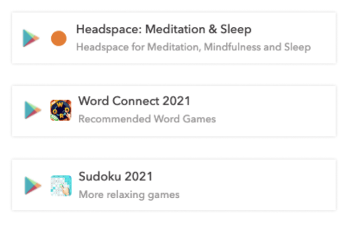
Examples of how apps have optimized their developer name on Google Play to target extra keywords.
5. App Subtitle (iOS) & Short Description (Android)
The subtitle and short description should explain what your app is about and convince users to download your app. Similar to the app title, keywords used in the subtitle (iOS) or short description (Android) do impact your app’s rankings and visibility.
Recommendations for the App Store:
The app subtitle can use a maximum of 30 characters. It not only appears on the app product page but also in the search results, underneath the title. Make sure to highlight your app’s main features or benefits and use keywords that are widely searched for in the app stores.
Again, be sure to avoid repeating keywords that have already been used elsewhere in the app metadata. Repeating keywords in the App Store does not add more weight to them, but is instead a waste of valuable space.
Recommendations for Google Play:
The short description is less visible on Google Play than on the App Store. It is not generally shown in the search results and only appears on the app page, below the screenshots and above the long description.
The short description should explain your app’s main features and/or benefits and include a call to action that encourages users to download your app.
The short description on Google Play is limited to 80 characters, giving the developer much more room to communicate the app’s value proposition. Keywords used in the short description are indexed by the Google algorithm, but we have also seen that they have little impact on rankings. In terms of keyword optimization, it is therefore recommended to focus on repeating your top targeted keywords and increasing the overall keyword density in the title.
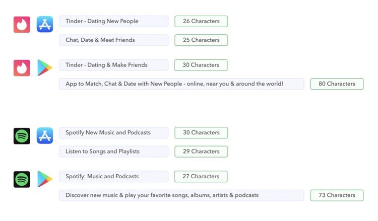
Tinder and Spotify have well-optimized subtitles (iOS) and short descriptions (Android). The apps uses all the available space to target relevant and high-volume keywords.
6. Information Panel
An information panel is displayed at the top of each app page on both Google Play and the App Store. The purpose of the panel is to inform users about the quality of the app. The information panel is clearly visible on each app page and contains important information that can help users decide whether to download your app. Since these metrics relate to your app quality, there are no quick wins to optimize this section of the app page.
On the App Store, the information panel shows:
- Total ratings & rating score
- Age restrictions
- Position in the top charts
- Developer name
- Languages in which the game is available
- Size
On Google Play, the information panel shows:
- Total ratings & rating score
- Total number of downloads
- Age restrictions
7. Screenshots
Screenshots are possibly the most important assets on your app page to help users decide whether or not to install your app. Carefully testing and optimizing your screenshots can therefore have a big impact on your app’s conversion rate. Keep the following tips in mind when designing your screenshots:
- Screenshots should be informative and showcase your app’s main features and unique selling points. Choose one feature per screenshot and zoom in on certain elements to grab the user’s attention.
- Screenshots are part of your app’s identity. Not only should they be visually appealing and aligned with your brand, but they should also be inviting and showcase your app’s distinctive user experience or gameplay.
- Make sure any captions are sharp, brief, and readable. Avoid using long sentences or small fonts.
- Localize your screenshots. Translate captions, but also research your target market and adapt your screenshots for specific cultures and values.
- A/B test your screenshots to understand what works best for your target market.
👉 More tips on how to design screenshots that convert
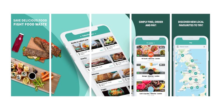
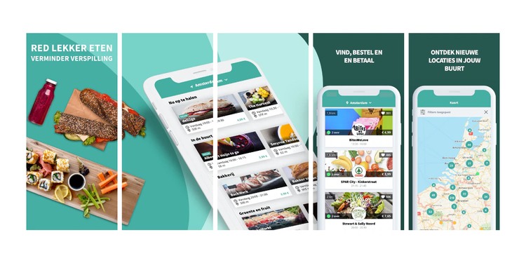
Great screenshot examples from TooGoodToGo (iOS, UK and the Netherlands). The screenshots are relevant to the brand, informative, and localized (the restaurants, map, and captions have been adapted for each market).
Recommendations for Apple App Store:
On the App Store, developers can add up to 10 portrait or landscape screenshots. When choosing portrait screenshots, only the first 3 will be shown in the search results. When choosing landscape screenshots, only the first one will be shown in the search results.
Screenshots are very visible on the App Store product page, appearing directly underneath the information panel in a scrollable gallery.
It is important to adapt screenshots to each Apple device that the app will be available for. Doing so will not only allow screenshots to appear in the right sizes on each device, but will also accurately demonstrate how your app will look on whichever device the store visitor is using.
👉 Learn more about specific screenshot size guidelines
Recommendations for Google Play:
Screenshots for Android apps only appear in the search results for branded keywords. When users search for generic keywords, apps are only listed alongside the app icon and title.
Screenshots also appear smaller on Android app pages compared to iOS app pages. So, when adding captions to your screenshots on Google Play, make sure the font is large enough for them to be readable.
Google recommends always adding at least 3 screenshots for games, and at least 4 screenshots for apps in either landscape (16:9) or portrait (9:16) format. The landscape screenshots are often used by Google to feature apps in other places across the store. If you have a portrait app or game, add the landscape screenshots behind the portrait screenshots.
Here are a few reminders when selecting your screenshots for Google Play:
- Never include any content that reflects or suggests Google Play ranking, awards, performance, user testimonials, promotional information, or price. For example, do not use words like “New,” “Discount,” “Best,” “Top,” “#1,” “Sale,” or “Million Downloads.”
- Do not use any form of call-to-action, for instance, “Install now,” “Download now,” “Try now,” or “Play now.”
- Refrain from showing people interacting with the device (for instance, fingers tapping on the device), unless the app usage or core gameplay is off-device.
- Avoid using screenshots that are distorted, blurry, or pixelated. Neither go for ones that are stretched or compressed.
- Do not use image elements in your screenshots that may be repetitive or inappropriate, such as third-party logos or characters without prior permission, device imagery, etc.
8. App Preview (iOS) & Promotional Videos (Android)
Videos are a great opportunity to show an in-depth preview of what users can expect if they download your app. Video previews are particularly recommended for games to demonstrate real user experience and gameplay. A video can also represent authenticity to help convince the user that they will enjoy this app or game.
Keep the following tips in mind when creating an app video:
- Aim to tell a cohesive story that gives users a sense of the journey they will experience when using the app. Think about promoting your most important features to excite store visitors and encourage them to download your app.
- Add graphic elements, such as touch hotspots, to your video to showcase navigation and interaction within the app.
- App videos play with the sound muted by default, so consider using text to give context to the footage. Make sure the copy is concise, readable, and stays on the screen long enough for users to read it.
- Creating videos does require some time and investment, so make sure your video is evergreen and avoid references to specific events or trending topics.
Recommendations for the App Store:
Videos on the App Store are referred to as app previews. You can add up to 3 app previews in portrait or landscape mode, but only the first one will be visible in the search results. The first preview video should focus on your app’s main features; the additional videos can be used to highlight supplementary content that users might not know about.
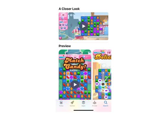
When you add preview videos in the same orientation as your screenshots (landscape vs portrait), the videos will appear in a horizontal scrollable panel before the screenshots. When you add a landscape video alongside portrait screenshots, the landscape video will appear above the portrait gallery in a section called “A Closer Look.”\
Example of how Apple displays a combination of both portrait and landscape videos on the app product page.
When adding a landscape video along portrait screenshots, the app preview video will appear in a section called ‘A Closer Look’
Apple has strict video guidelines. Videos should only focus on the in-app experience and cannot be overly promotional (e.g. you can’t show footage of people interacting with the app or behind-the-scenes footage). Keep videos short (between 15 – 30 seconds) and focus on grabbing the user’s attention in the first few seconds.
When uploading your preview video to the App Store Connect, you will have to choose a poster frame that will be displayed when your video is not auto-playing. Choose a poster frame that is compelling and well-connected to the screenshots.
Recommendations for Google Play:
Similar to screenshots, promo videos only appear in the Google Play search results for branded searches. But, just like app previews, they appear before the screenshots on an app page and provide the opportunity to give a sneak peek of your app’s main features.
Google Play promo videos need to be uploaded to YouTube before being linked to the app product page. Use a video’s full YouTube video link instead of a shortened link. Since these are YouTube videos, they need to be recorded in the standard 16:9 format. However, many app developers choose to display a portrait phone view within the 16:9 format.
Unlike the App Store, Google Play does not have strict promo video guidelines. Videos can therefore be longer and more promotional than on the App Store. We do however recommend keeping promo videos short (30 – 40 seconds max), concentrating on the user experience and gameplay.
When adding a promo video, it is recommended to upload a feature graphic. The feature graphic is the video’s poster frame or overlay; it is a placeholder image that displays together with a “play” button right before the video begins. This asset needs to be uploaded directly onto the app page (not YouTube), and should be compelling and convey the main essence of your app. Again, make sure the feature graphic connects well with the screenshots that are shown next to the video.
Here is what Google highly recommends for your app preview videos:
- Show your app’s or game’s main features within the first 10 seconds of the video.
- Reduce logos, title screens, cutscenes, or other promotional content in the video.
- Similar to screenshots on Google Play, do not include people interacting with the device.
- It is highly recommended to create a video in landscape orientation rather than a portrait format, as your video will show in a landscape video player. Even if your app or game is in portrait orientation, create a landscape video that is zoomed in to the game/app experience.
- Do not use promotional terms or calls-to-action, such as “#1,” “Top,” “Best,” “Discount,” “New,” “Million Downloads, “Sale,” “Download Now,” “Install Now,” etc. However, awards from Google Play, such as “Best Of,” are permitted to be displayed in the video.
- It is best to avoid using transitory content that can become quickly outdated to reduce the need to update.
9. Long Description
The long description is where developers can provide store visitors with more information about their app’s main features and benefits.
On both stores, the long description can contain up to 4,000 characters. Despite the generous character limit, long descriptions are not very visible on app pages. On Google Play, users need to click on the “read more” arrow next to the short description to view the complete long description. On the App Store, only the first 3 lines of the long description are shown on the app page below the screenshots. To read more, users need to click.
Nevertheless, the long description provides an opportunity to promote your app and highlight your key differentiators.
Keep the following tips in mind when optimizing your long description:
- Structure your content in easy-to-read paragraphs with clear subtitles. This makes it easier for users to scan your content and read what is most important for them.
- Make the first lines count. Few users will scroll down all the way to read the full long description. Make sure to grab their attention and convey your main message within the first 3 lines.
- Include mentions, awards, and impactful reviews. However, be respectful of the store’s guidelines and avoid using unattributed or anonymous reviews.
👉 More tips on how to optimize your long description
Recommendations for the App Store:
Keywords in the long description are not indexed by the App Store algorithm. This means that Apple does not account for keywords used in the long description to decide when/how to rank your app. With this being said, you can utilize this space with the main objective of increasing conversion.
Recommendations for Google Play:
Unlike Apple, the keywords used in the long description do rank on Google Play. Therefore, the long description can play a major role in increasing your app’s visibility. Optimizing your long description for keyword visibility is similar to optimizing a blog post for SEO. Pick a handful of relevant, high-volume keywords and try to increase the density of these keywords to 2-3% throughout the text (while avoiding keyword stuffing).
Pay extra attention to the first two or three sentences of your long description. Keywords used in the first three lines of your long description likely hold more weight in the algorithm than keywords mentioned later on.
Here are a few points to recall while writing your app’s long description on Google Play:
- Repeat your keywords in your app’s short and long description, so that Google understands that it is a keyword. However, refrain from keyword stuffing (ideally, you should not repeat a keyword more than 3–5 times), and unnecessarily including a keyword where it doesn’t make sense.
- Do not clutter the long description with keywords for the sake of it. Google algorithm figures out if you are just randomly throwing your keywords in the text or actually using those words to create a helpful, informative text.
- Users scroll down to your long description to better understand the intent/purpose of your app. Therefore, use the field to provide a convincing argument and explain more about your app’s features.
10. iOS Keyword Field
When updating your app page on the App Store Connect, you will see that Apple allows you to provide keywords separated by a comma in a designated field called “keywords”. This keyword field is not visible on the app page itself and has only the purpose of aiding keyword optimization.
Choose your keywords wisely following ASO best practices:
- Choose keywords that truly describe the functionality of your app (e.g. don’t target the keyword “flights” if the main purpose of your app is to book hotels).
- Consider using an ASO tool like AppTweak to analyze keyword metrics and choose keywords with a high volume and low difficulty score.
You can only add up to 100 characters in the keyword field. So keep the following tips in mind to fully optimize your app’s visibility:
- Use all of the 100 available characters.
- Use commas to separate keywords (don’t add spaces).
- Use singular words. According to Apple, in most cases, apps will rank for both plural and singular terms. However, this might not always be the case in foreign languages. As such, be sure to test this out.
- Don’t repeat keywords from your title, subtitle, publisher name, or category name. Apple does not consider keyword density so repeating keywords is just a waste of space.
- Use single keywords rather than long-tail combinations. The iOS algorithm will automatically combine all keywords used in your metadata to form long-tail combinations. For example, instead of adding “word puzzle,” add “word, puzzle” – this would increase your chances of ranking for “word,” “puzzle,” and “word puzzle”).
- Avoid using special characters such as “@” or “#” or “!”.
- Don’t add competitor names or other trademarked terms.
| Expert Tip Don’t include words such as “app,” “free,” “iphone,” “ipad,” “new,” or “best” in the keyword field. The algorithm will automatically rank your app for these keywords when needed. |
11. iOS Promotional Text
On the App Store, developers can add a promotional text field. This field is limited to 170 characters and presents a unique opportunity to get people excited about your app’s promotions, upcoming features, and other time-sensitive events or sales.
The promotional text is only displayed on the app page, underneath the screenshots but above the long description. Keywords used in the promotional text are not indexed by Apple’s algorithm.
This is the only field on your product page that can be edited without having to resubmit your app to the store. That being said, with every app update you submit, this field will be overwritten and return blank if no text is provided. Therefore, it is recommended to use this field as Apple intended it to be used – to promote seasonal offers and promotions, not to highlight your app’s features.
12. Ratings & Reviews
Ratings and reviews are a major, but often overlooked, element of app product pages on both the App Store and Google Play:
- Both app store algorithms account for ratings and reviews when deciding which apps to show in the search results. Each store wants to provide visitors with the best user experience and will only show apps that are well-liked by the audience. As a result, apps that have few reviews or low ratings might rank lower on certain keywords.
- Ratings also occupy a prominent position in the store search results and app product pages. A good rating can set your app apart from competitors and convince users to download your app instead.
- Furthermore, Google Play has recently tested rating filters in the search results, allowing users to only see apps with a certain rating.
Ratings and reviews play an important role in helping users decide whether to download your app. Getting an influx of positive ratings and reviews overnight is not easy and requires a long-term strategy. Both Apple and Google have implemented native features to help developers request reviews or feedback from their users. When using these review prompts, make sure to choose the right moment and only ask users to rate your app when they are most likely to be satisfied with the experience.
If possible, make sure to reply to reviews, especially negative ones. Not only will this increase the chances of the user coming back and changing the review score, but it also shows potential customers that you listen and consider feedback.
With AppTweak’s Reply to Reviews feature, you can also now directly reply to your app reviews on our tool. You no longer need to go back to your console and check every single review to make sure you replied to them all!
13. What’s New
With every app update, you can communicate the latest changes and updates via the “What’s New” section on the app page.
The section is not very visible on the app page, and keywords included here won’t help you boost app rankings. However, you can use this section to your advantage and make your app stand out from the competition.
Avoid listing bug fixes and rely instead on telling a story about the new features and improvements. Use this field to get people excited and inform them that they have been heard and that their feedback matters.
Text here is limited to 4,000 characters on the App Store and 500 characters on Google Play.
14. iOS In-App Purchases
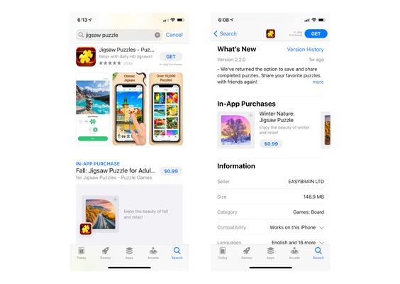
In-app purchases (IAP) are extra content or subscriptions that can be bought inside an app or game. IAPs can be displayed on your app page and also in the store search results.
Example of how in-app purchases appear in the search results and on the App Store app page.
Because IAPs show in the App Store search results, ASO experts believe they can be optimized for keyword discoverability. However, the algorithm is not very optimized and, for now, IAPs rank for exact title matches in the search results.
Apple allows you to promote up to 20 in-app purchases on your app page, and each IAP can be optimized with its own unique name, description, and icon. The name is limited to 30 characters; in the description, you can add up to 45 characters.


