In the high-stakes world of mobile apps, success hinges on striking the perfect balance between delivering a stellar user experience and effectively monetizing the app for maximum revenue. It is no easy feat, but this balance determines which apps thrive and which ones fail in the dog-eat-dog world of apps.
With more and more apps entering the market every day and saturating every conceivable vertical, app developers and marketers alike have to be increasingly creative to attract and retain users, and, most importantly, guide them through the paywall, turning them into loyal, paying customers.
We have already extensively discussed user acquisition, user engagement, and the fundamentals of app revenue and monetization. So today, it is high time we talked about app paywall optimization – i.e., how to strike the right balance between user experience and revenue generation.

In this article, we will explore what a paywall is, discover the different types of paywalls that exist out there, provide examples of effective paywalls, and offer insights on how to optimize a paywall for maximum success. I have plenty of tips, best practices, and insights to share, so let us dive in.

App Revenue Buyer's Guide
Download the App Revenue Buyer’s Guide today and start shaping the future of your app! Your journey towards app monetization mastery begins now.
What are paywalls and where to find them?
Before diving head-first into how to cut through the noise with effective app paywall optimization, let us get a few things straight. First and foremost, what is a paywall?
A paywall limits users’ access to certain app features and/or content, requiring them to either make a purchase or subscribe if they want to unlock an app’s full functionality. As such, you would typically expect to see paywalls only in the freemium version of a free app.
Paywall examples from News apps

Source: Paywall Screens
If an app’s revenue strategy relies on subscription monetization and/or in-app purchases (IAPs), having an effective paywall strategy is a must, and I cannot stress this enough. A good paywall essentially determines how many of your freemium users convert to a paid plan and keep using the app long-term.
Explore more paywall examples here.
How do paywalls work?
So, we now have a good understanding of what a paywall is, but how does it work?
As with most things in the app world, it all begins with app discovery and installation (cue parting clouds, a serene blue sky, and gentle music swelling). A user discovers, installs, and starts exploring an app. So far, so good!
At this stage, the user is typically given access to a limited set of features and content for free. The idea behind this initial exposure is to showcase the app’s capabilities and functionalities, demonstrate its value, and encourage the user to keep exploring further.
As the user continues to interact with the app, they eventually come across the paywall. This usually happens after a specific trigger. This trigger can vary depending on the type of app. For instance, one of the most common triggers is a user attempting to access premium content. Other common triggers include reaching a preset usage limit in the app, such as when a thirty-day free trial expires.
At this point, the user is faced with a decision. They must choose whether to stick with the free version of the app, if it is available, or to unlock the full experience by paying for premium content.
To sway the user’s decision, apps often offer incentives like limited previews of premium content or discounted subscription offers.
If the user opts to subscribe or make an in-app purchase, they are taken to a secure payment page where they can complete the transaction using their preferred payment method. Once the payment is successfully completed, the user gains full access to the premium features and/or content previously hidden behind the paywall. Et voilà!
Types of paywall
So far, so good, right? Seems simple enough! But what if I told you that not all apps use the same type of paywall? In fact, there are many different paywall strategies, each tailored to when, how, and where an app aims to convert users. Unfortunately, there is no one-size-fits-all solution. So, let us have a look at the various types of paywalls out there.
Disclaimer: There are many ways to categorize paywalls, so no list can ever be fully comprehensive. The one below is adapted from Adapty’s and Glassfy’s lists (links provided below). Be sure to check out their lists for excellent examples and proactive tips for each type of paywall.
🔎 Hard paywall: A paywall that requires users to pay upfront before granting access to any of the app’s features.
🔎 Soft paywall: A type of paywall that allows users to experience a limited version of the app before prompting them to subscribe.
🔎 Standard non-scrollable paywall: A single screen featuring an app’s value, main features, pricing, and a call-to-action.
🔎 Landing page paywall: A scrollable, long-form paywall that functions like a landing page, offering more room to highlight an app’s value.
🔎 Modal paywall: A strategically timed pop-up that encourages users to subscribe or keep using the app.
🔎 Trial paywall: A type of paywall that provides users with temporary access to premium features for free, allowing them to experience the benefits for a limited time.
🔎 Trial toggle paywall: Similar to a trial paywall, this type of paywall includes a toggle feature that lets users choose whether to receive reminders before the trial period expires.
🔎 Single plan paywall: A simple paywall presenting users with a single pricing plan option.
🔎 Multiplan paywall: A paywall that presents multiple pricing tiers, each with varying features and benefits.
🔎 Offer paywall: A type of paywall displaying exclusive deals or time-limited offers to motivate users to take immediate action.
🔎 Personalized paywall: A type of dynamic paywall that tailors its messaging and offers according to a user’s behavior.
🔎 Time-limited paywall: A paywall providing full access to the app for a limited time, after which it switches to a standard or modal paywall.
🔎 Content-specific paywall: A type of paywall granting access to specific sections or types of content within the app, rather than unlocking full app access.
🔎 Dynamic paywall: A paywall that adapts pricing and access to premium content and features based on factors such as region, user activity, user behavior and engagement, and other variables.
🔎 Donation paywall: A paywall that, instead of requiring users to pay to access the app’s content and features, asks users for voluntary contributions.
Sources: Adapty
What does an effective paywall look like?
Now that we’ve covered what a paywall is and the different types available, it’s time to dive deeper. What makes a paywall truly effective, and what key elements should it include? Let’s explore.
Elements to include in a stellar paywall:
- Clear headline: Catchy, snappy, attention-grabbing, communicating the app’s value instantly.
- Compelling visuals: Engaging images or videos that highlight and reinforce the app’s benefits.
- Concise copy: Short, persuasive text highlighting key features and value, enticing users to commit to a paid plan.
- Transparent pricing: Clearly displayed pricing options with easy-to-understand tiers and the benefits of each one (if the app uses a multiplan paywall).
- Limited-time offers: Discounts, free trials, and/or promotional pricing to encourage users to take action. Definitely not a must-have, but certainly a good-to-have.
- Call-to-action: A bold and easy-to-see “Subscribe” button to drive conversions.
- Cancelation policy: Build trust by adding a short disclaimer that clarifies the user’s right to cancel or opt out of the subscription at any time.
Example paywall layout
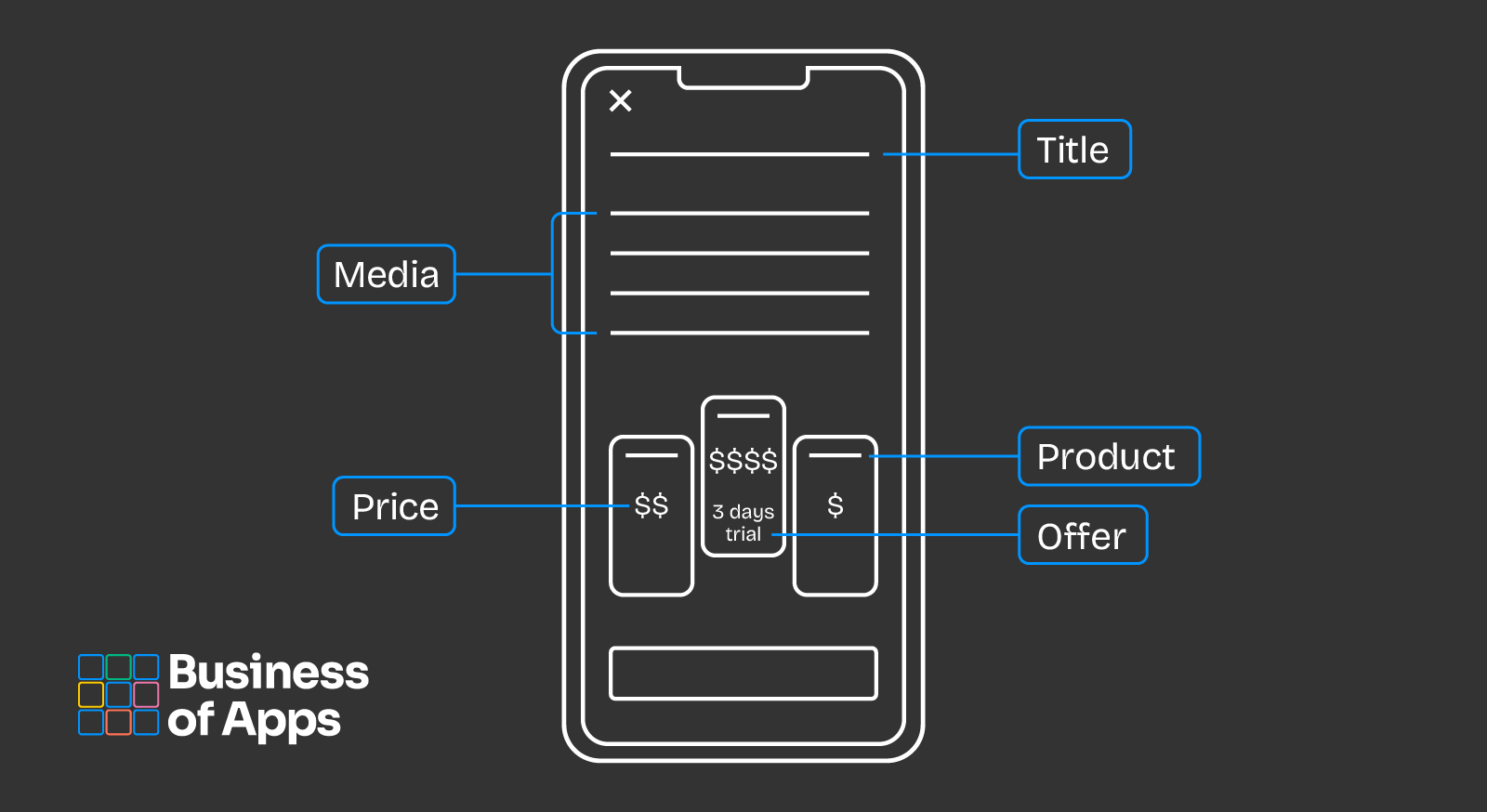
Source: Adapty
The headline should immediately convey the app’s value, clearly highlighting what users will gain by subscribing. Supporting visuals—whether product images or short videos—add depth, clarity, and appeal to the subscription offer.
The copy should be concise yet persuasive, outlining the value proposition in a few key points without overwhelming the user. The design should follow a clean, minimalistic layout, with pricing options and key benefits prominently displayed.
Transparency is crucial. Pricing tiers should be straightforward, with each option clearly labeled to help users make informed decisions.
Best practices for app paywall optimization
Test, test, test
This point might seem obvious, but it’s often overlooked. When it comes to creating a stellar paywall that converts hundreds of users daily, success always comes down to testing and iteration.
Optimizing for user behavior is essential, and that means continuously A/B testing everything — from pricing models to button colors — to determine what performs best.
In short, test everything. Pay attention to the data you gather, and make adjustments to any aspect of the paywall that isn’t delivering results. This data-driven approach ensures the paywall keeps evolving to meet user needs while maximizing revenue potential.
Additionally, the strategies we’ll discuss below all depend on ongoing testing to reach their full potential and efficiency.
Segment, segment, segment
It’s no secret that not all users are the same—it’s practically a timeless truth in marketing.
That means developers need to segment their users into distinct cohorts, assigning each one a specific user persona to ensure they’re targeted with the marketing materials most relevant to them.
The same principle applies to paywalls. From images and copy to calls-to-actions and personalized offers, different users will respond to different approaches. It’s up to developers and marketers to understand what each user wants and needs, and deliver the right messaging and offers accordingly.
This is where segmentation becomes your greatest asset. By segmenting users, developers can target them based on location, age, device, interests, engagement level, in-app behavior, and overall app usage. After a set period, users should also be assigned a persona that reflects their interactions and preferences.
I’m sure you get the idea. I’ve discussed segmentation in detail before, and you can learn more about it here.
Personalize, personalize, personalize
Closely tied to testing and segmentation, no app can truly thrive in today’s competitive landscape without offering a personalized user experience.
The same principle applies to your paywall offerings. With the wealth of data at your disposal, you can ensure that each user sees a paywall tailored to their profile, offering them exactly what they need and want.
Use this data wisely to craft compelling messaging, visuals, offers, as well as the timing and placement of the paywall. Sometimes, it really is that simple. The hard part is getting all this done while juggling all your other daily tasks!
From timing and messaging to placement, timing, and offers, every element should be personalized for maximum impact.
Emphasize value, not features
A common mistake many app developers and marketers make is overemphasizing flashy features, forgetting that users are drawn to apps for the value they provide—not just the features.
Instead of promoting an app’s features at every turn, focus on highlighting the benefits a user will gain from subscribing. A key question to ask is: How will this app improve the user’s life?
At the end of the day, it’s all about the unique selling proposition (USP), not the flashiness.
Once you’ve answered that question, shape your value proposition around it. Entice users by offering them what they truly need and want. The goal is to position your app as a solution to their problem—frame your messaging and the subscription’s value accordingly.
And remember, not every user is the same or has the same goals. Keep testing (as discussed earlier) and create tailored value propositions for each user persona. Typically, users interact with an app for at least a few hours before encountering its paywall, giving developers ample time to gather the necessary data to understand what each user is looking for.
Beauty is in the eye of the beholder
Did you know that most users close a paywall within just 10 seconds? In fact, 68% of users do.
This highlights how crucial it is to design an aesthetically pleasing paywall that immediately grabs attention, piques interest, and encourages users to explore your value proposition.
A visually appealing paywall — featuring sleek design, high-quality imagery, elegant typography, clean and well-organized layouts, cohesive iconography, and subtle animations — can make a big difference. When these elements are wrapped in your app’s brand colors and aligned with your business’s visual identity, they go a long way in convincing users to engage further.
For more paywall design tips, check out this post.
Catchy call-to-actions are the name of the game
A well-placed, sleek call-to-action (CTA) button can make all the difference. And, to give away a secret, there are more options than just ‘Subscribe’. Experimenting with the button’s colour, size, and placement can also do wonders for your paywall’s conversion rate.
A great strategy is to A/B test multiple CTAs to determine what resonates best with each user cohort and what triggers they’re most likely to respond to.
Pricing transparency
Being upfront about the monetary commitment your app requires is crucial for building trust and user loyalty.
In other words, ensure that your pricing options and the benefits of each tier are clearly displayed. Users won’t appreciate a sudden price hike when they reach the payment page, so make sure the full price is visible on the paywall from the start.
Another way to foster trust and transparency is to include a brief cancellation disclaimer on your paywall, reassuring users they can opt out anytime.
Additionally, remember that your app’s price isn’t set in stone. Experiment with different pricing strategies, such as billing periods, introductory offers, and pricing tiers, to find the right balance. Don’t just set a price and call it a day — test and iterate until you understand the true value of your app subscription.
Paywall triggers and visibility
It’s a no-brainer that you want all your users to see your paywall — after all, it’s the best way to showcase what they might be missing and encourage them to subscribe.
A great way to increase paywall visibility is through contextual triggers. A rule of thumb for in-app purchases (IAPs) and subscriptions is not to bombard users with offers as soon as they start using your app. Let them explore and familiarize themselves with it first.
Then, at the right moment, introduce your paywall. By making it an integral part of the user journey, you not only avoid being intrusive but also make the paywall more effective. This approach gives you time to gather data on your users, allowing you to present your best offer at a time when they’re most likely to convert.
Examples of paywall triggers include users attempting to access premium content or using the app for a set period of time. These ensure the paywall appears when users are most engaged and receptive, increasing the likelihood of them subscribing.
Another option is to place the paywall in strategic, non-intrusive locations — like the home screen. This boosts visibility without overwhelming users who are still getting to know your app and might not be ready for a paid commitment yet.
Additionally, consider including a screenshot of your paywall in your app store previews.
For maximum exposure and success, utilize all these strategies at once, ensuring that users encounter the paywall at multiple points without feeling overwhelmed.
Finally, timing is just as crucial as placement. Consider when users are most engaged, consuming valuable content, or ready to take action. Presenting the paywall during these moments can significantly boost conversion rates.
Great onboarding
I’ve emphasized the importance of a great app onboarding process before, and I really can’t overstate how crucial it is. A stellar onboarding experience sets the foundation for all future engagement between the app and the user. If onboarding falls short, users will churn before they even reach the paywall.
It’s also essential to design an onboarding flow that naturally leads users toward discovering the paywall—think of it as ‘all roads lead to subscription’.
An effective onboarding process should be informative, ensuring users know how to navigate your app and setting them up for success. It should also spark their interest in premium content and features, creating a natural curiosity that primes them for paywall discovery. This process makes users more receptive when they first encounter the paywall, increasing the likelihood of conversion.
A longer paywall is better than a short one
Forgive the innuendo, but a fact is a fact. Longer paywalls are generally more effective. They give you the opportunity to display more information, present multiple pricing options, and elaborate on your USP.
However, this doesn’t mean cramming in all the information you have. It’s a delicate balancing act — include just enough to convince users of the app’s value without overwhelming them. The key is to show what’s most relevant to each user based on their persona and app usage.
In other words, while longer paywalls tend to perform better, it’s up to you to determine the ideal length. And how do you figure that out? Through testing, of course—bringing us full circle!
Final thoughts
Optimizing an app’s paywall is not just about driving revenue—it’s a critical component of the user experience that directly impacts long-term success. As we’ve discussed, an effective paywall strategy can transform curious users into loyal, paying customers. However, striking this balance requires thoughtful planning, continuous testing, and a deep understanding of your audience.
Not all paywalls are created equal, and your approach should be as dynamic as the users you aim to convert are. A successful paywall must be both user-friendly and designed to emphasize what truly matters to your users. App paywall optimization is an ongoing process of refinement, testing, and adaptation. There’s no one-size-fits-all solution, but by following the strategies outlined in this guide, you’ll be well-equipped to convert more users and maximize your app’s revenue potential.