With over seven million apps in the app stores, competition is fiercer than ever.
Users take 3-6 seconds to decide whether to continue browsing or hit that download button. But even with paid media traffic and well-optimized metadata, you might find your app’s conversion rates (CVR) aren’t meeting expectations. So, what’s the missing piece of the puzzle? The answer may be your app’s creative assets.
Effective app creatives, such as screenshots and preview videos, can boost user attraction, conversion, and retention. However, creating these assets is just the beginning. The real magic lies in conversion rate optimization (CRO) – testing different asset combinations to maximize conversions.
This article will delve into how to test and optimize your app store creatives, highlighting the top tips and best practices for enhanced CVR and engagement.
Understanding app store creative assets
App store creatives are the visual elements that users first encounter when they land on your app’s page. These assets play a crucial role in shaping a user’s first impression of your app and significantly influence their decision to download it.
App icon
The app icon is your most valuable creative asset, as it’s the first visual element that users see when browsing the app stores. A well-designed app icon can capture users’ attention, pique their curiosity, and encourage them to explore your app further.
App icons
Source: Moburst
How to test app icons
App icons are crucial to the Conversion Rate Optimization (CRO) process as they appear in every event throughout the conversion funnel, from the search page to the app page to eventually on the user’s device after installing the app.
To boost your conversion rate (CVR) with app icons, make significant changes for smaller apps and minor tweaks for larger brands, then test them to see which performs better. Regardless of the approach, leveraging this asset can significantly improve your CVR.
Context-aware tech: The secret to 81% more conversions
Learn how leading apps are using context-aware technology to deliver perfectly-timed offers, reduce churn & transform passive users into loyal fans.
Learn moreTesting app icons: Play Store vs. App Store
In the Google Play Store, the app icon is the only creative asset visible on the search page. This makes it a critical factor for improving CVR as it’s the first thing a potential user sees when they search for an app.
- The Google Play Store allows you to freely upload new icons for testing purposes, providing opportunities to optimize the icon based on user response.
- On the other hand, the App Store presents both the app icon and the first screenshot or app preview video on the search page.
- Apple also has tighter control over icon changes, requiring all variants to be submitted for review. This can make the app’s A/B testing process more challenging on the App Store compared to the Google Play Store.
App screenshots
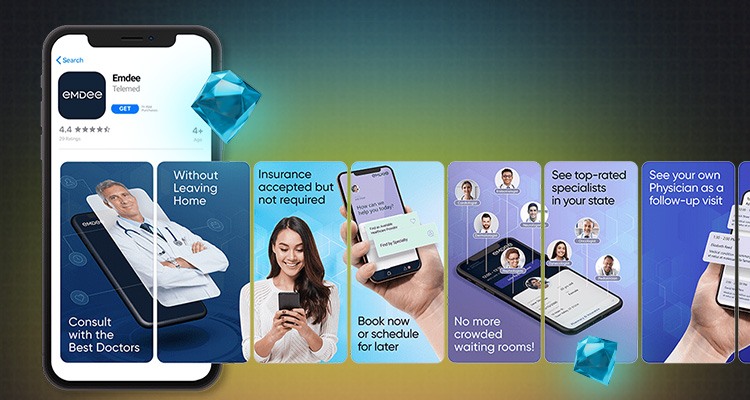
App screenshots offer a glimpse into what users can expect from your app. They showcase your app’s functionality and user interface (UI). High-quality, engaging screenshots can compel users to download your app.
App screenshots
Source: Moburst
How to test app screenshots
Optimizing conversion rates requires A/B testing different screenshot designs to determine which resonates with your target audience. After completing the initial testing phase, fine-tune and test one element at a time to ensure your app screenshots are as effective as possible.
Here are our top tips for effective screenshot testing:
- Highlight key features: Your screenshots should depict the app’s benefits. The first screenshot, being the most viewed, should be the highest converting.
- Use captions: Brief, compelling captions emphasize your app’s value and direct attention to each screenshot’s crucial aspects.
- Test different orders: The screenshot sequence can influence user perception. Find the order that best narrates your app’s features.
- Experiment with orientation: Consider switching between portrait or landscape screenshots depending on your app’s category. For instance, landscape screenshots can enhance the UI of mobile games. Choose the orientation that highlights your app’s strengths.
- Showcase the UI: Test varying images. Depending on your app’s goals, include more or less of the UI or add real people if it contributes to your messaging.
- Consider the font: Adjust font sizes or styles based on performance.
- Monitor performance: Use tools like App Store Connect or Google Play Console to track screenshots and A/B test performance and optimize them based on data-driven insights.
Testing app screenshots: Play Store vs. App Store
App screenshots can contribute to CRO on both app stores.
However, platform differences can affect app performance:
- Visibility in search results: The App Store displays screenshots in search results, with the first two often being viewed the most. The Play Store doesn’t, which can affect CVR.
- Display size: App screenshot sizes differ between each app store. On the Play Store, app screenshots appear smaller than on the App Store’s product pages. To optimize visibility across both platforms, adjust your design, font size, and messaging to fit each store’s specifications.
- Orientation: Portrait orientation is typically preferred for the App Store, but mobile games might benefit from using landscape screenshots. The Play Store requires more nuanced testing, as both can be effective.
- Upload limitation: The App Store permits up to 10 screenshots, while the Google Play Store allows eight – both offer ample opportunities to highlight your app.
- A/B testing: Both stores support A/B testing. However, Apple’s stricter review process contrasts with the Google Play Store’s flexibility, making the latter more conducive to rapid optimization.
App Preview/Preview Video
App preview videos, known as App Previews in the App Store and Preview Videos on the Play Store, offer a visual snapshot of your app’s features and USP. A compelling preview video can boost CVR by up to 26%, making it a powerful asset to focus on.
How to test app preview videos
Here are some best practices for preview video testing:
- First impression is key: The initial three seconds should captivate viewers. Start with a strong message highlighting your app’s USP to enhance engagement.
- Video pace: Maintain a pace that allows viewers to grasp the content without feeling overwhelmed or bored.
- Less than 2% unmute the video: Since most viewers watch preview videos with the sound off, prioritize visually engaging content that communicates effectively without audio.
- Keep it concise: Both stores limit video previews to 30 seconds, so convey your core message early to prompt users to download the app.
- Avoid performance, ranking, price, and promotional information: Keep your preview video evergreen and avoid time-sensitive content, as it can change over time and will likely not represent the app’s user experience.
- Aim for at least 80% of the video to represent the user experience and interface: Your video should show actual in-app experiences to give viewers an accurate app preview.
- Test different orientations: As with app screenshots, you can choose between landscape or portrait preview videos. Test to see which type best fits your app’s category and goals. For mobile games, landscape videos typically perform the best.
- Utilize a hybrid gallery: This will ensure the video is visible on the search results page and relocate it to a section called “A Closer Look” on the App Store.
Testing app preview videos: Play Store vs. App Store
App Previews autoplay (on mute) on the App Store when users access your app’s page. In contrast, users must tap the preview video on the Play Store for it to play. This highlights the significance of an effective thumbnail image, potentially being the initial visual users encounter on your app’s page.
Feature Graphic/Poster Frame
The app preview video’s thumbnail, known as a Feature Graphic on the Play Store and Poster Frame on the App Store, is showcased when the video doesn’t play automatically.
How to test Feature Graphics/Poster Frames
Determine which elements to compare for testing, such as color schemes, text placements, character images, or call-to-action buttons. Ensure each version is distinct for conclusive results.
Some feature graphic best practices to consider:
- Display your logo optimally, ensuring it complements the app’s key USP.
- Be mindful of the Play Button’s location in your design, and avoid cluttered graphics due to space constraints.
- Design the thumbnail as a unique visual, distinct from the other app screenshots.
Feature Graphics and Poster Frames: Play Store vs. App Store
Feature graphics are especially crucial on the Play Store since preview videos won’t autoplay. They serve as the primary visual for users and can influence their initial impression and CVR. They’re also visible in various editorial sections of the Google Play Store, enhancing browse traffic.
The App Store doesn’t permit uploading specific images as poster frames, so ensure your video contains frames that can work as one. Conversely, the Play Store lets you customize the thumbnail for your preview video.
Boost conversion rates with seasonal creative bundles, Custom Pages, Listings and event promos
We’ve covered how app store creatives can boost your app’s product page. But they’re not just limited to that. They can also be used for seasonal marketing, optimizing custom pages and store listings, and promoting special events.
Seasonal creative bundles
Effective seasonal marketing can enhance app store conversion rates by 15-20%.
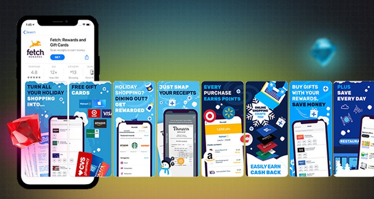
App seasonality includes themed visual elements reflecting specific times or events. For example, updating your app’s icon with a festive design during Christmas and showcasing holiday-themed in-app content can create timely relevance, attracting more users.
App seasonality
Source: Moburst
Types of seasonal creatives
- Holiday creatives: Design a bundle featuring icons and screenshots tailored to your target users’ local holidays.
- New Year creatives: As the New Year approaches, emphasize designs related to resolutions, especially for health, finance, or productivity apps.
- Category-specific seasonality: Tailor your creative bundle to special events or seasons relevant to your app’s users. For example, a sports app might feature designs related to major sporting events.
Seasonal creative bundles: Best practices
- Maintain cohesiveness: Ensure a consistent festive design across icons and screenshots. If your app preview video isn’t seasonally apt, remove it temporarily for visual consistency.
- Stay current: Switch back to your original app creatives as soon as the season ends to maintain relevance.
- Consider your audience: Different designs resonate with different users. Utilize Custom Product Pages (CPP) on the App Store and Custom Store Listings (CSL) on the Play Store to cater to specific demographics.
- Test before implementing: Always test your seasonal creatives before rolling them out, but avoid testing during holiday peaks to prevent skewed results.
Custom Product Page (CPP) and Custom Store Listing (CSL)
Custom Product Pages and Custom Store Listings are effective strategies to test app creatives, improve CVR, and enhance App Store Optimization (ASO) efforts.
Custom Product Pages
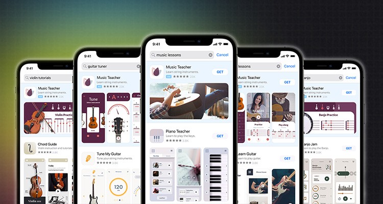
Available on App Store Connect, CPPs let you design unique app listings for specific user segments, enhancing your Apple Search Ads (ASA) campaigns.
Custom Product Pages
Source: Moburst
You can choose from existing CPPs when setting up ad variations, ensuring a consistent user experience as the ad’s creative elements align with the CPP. This approach allows you to cater to each audience segment with tailored creatives and messages.
Custom Store Listings
Accessible via the Google Play Console, CSLs function similarly to CPPs, allowing you to test ads and target distinct user segments with a unique URL.
Apple supports up to 35 custom product pages, while Google Play allows up to 50. Both platforms facilitate the testing of screenshots and videos. However, Google Play offers additional testing for icons and feature graphics through CSL and provides insights into organic and referral traffic via unique URLs. Meanwhile, Apple focuses primarily on paid traffic.
Both CPPs and CSLs are crucial for app creative testing, CVR optimization, and ongoing performance evaluations. Compared to temporary content like seasonal promotions or In-App Events, CPPs and CSLs offer sustained optimization opportunities.
In-App Events (IAEs) and Promotional Content
In-App Events (IAEs)
In-App Events are unique activities or experiences promoted on the App Store. They’re showcased on your product page, search results, and other curated sections. These can include live concerts, fitness challenges, game tournaments, and more. Since events last only up to 31 days, they create a sense of urgency for users to download your app.
To achieve successful CRO with IAEs, prioritize the creation of an engaging event page. As text is not permitted in IAE creatives (it is added as an overlay on the event page), the arrangement of visuals in the event image or video plays a crucial role.
An effective promotional image or video can motivate users to participate in your IAE, increasing engagement and conversions.
Promotional Content
Previously termed LiveOps, Promotional Content can be leveraged to highlight timely content, including events and major app updates on the Play Store.
Unlike Apple’s IAEs, Promotional Content allows app owners to promote special offers, including discounts and rewards. This strategic approach can entice users to actively engage with your app and take advantage of these offers.
In fact, according to Google’s analysis, developers who utilize promotional content observe a 2% increase in 28-day active users and a 4% boost in revenue.
Promotional Content
Source: Moburst
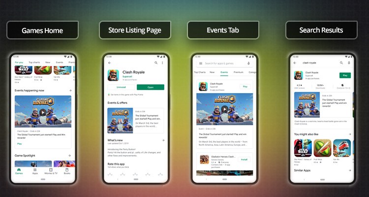
Promotional content can appear on the Games tab, Events tab, store listing page, or in search results.
Similar to IAEs, promotional content creatives cannot include text. Instead, focus on testing visually captivating creatives that can accommodate text placement at a later stage to optimize results.
Conclusion
Leveraging app creatives for CRO is important for long-term app growth and success. By strategically testing and optimizing them for your app’s product page and promotional content, they can help lower acquisition costs, increase ROI, improve CVR, drive downloads, and foster user retention and engagement.
Ready to elevate your app to new heights? Contact Moburst for a free consultation!


