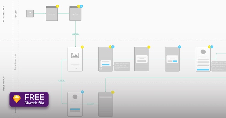
User onboarding is an essential part of product definition. It has so much to do with an app’s success, that it can make or break it. However, if done right, user onboarding will result in people coming back to use your mobile app over and over again.
As a mobile app development company, we’ve amassed a lot of experience regarding the user onboarding process over the years. That’s why we decided to come up with a straightforward framework dubbed Instruction-Action, in an attempt to understand and design the best user onboarding experiences for our clients’ mobile products. We’ll go through everything that this framework entails, covering user onboarding best practices, the crucial elements of user onboarding, and more.
This article was first published on Tapptitude blog.
What is user onboarding and how to make the best of it
Great user onboarding feels effortless, natural even. It should demonstrate value and bridge the gap between users’ expectations and what your product can help them achieve.
Picture this: after weeks of brainstorming, sketching, designing, and arduous development, your mobile app is finally ready to launch. Your team’s enthusiasm is through the roof. This is the moment of truth: will your app be successful? Will the onboarding process convince the user to take the first step towards using the product? Will it convince them to go further? This is where our user onboarding guide comes in handy.
The Instruction-Action framework is based on strategically playing with the two building blocks of the user onboarding process, namely the instruction elements, and the action elements.
Instruction elements
Instruction elements are your best friends. Whether we’re talking about annotations, modals, or any other bits of copy, you can use instruction elements to efficiently communicate to the user how to use the app. As a result, they will be able to uncover the app’s core value and use it to its maximum potential.
Some of the most popular instruction elements include splash screens, welcome screens, annotations, permissions, and explanatory modals. People won’t come back to use your app a second time if they don’t immediately understand how to get the most out of it.
Action elements
Nir Eyal’s Hooked model states that the actions someone takes within a product are triggered by carefully designed persuasion elements. Ideally, such elements are a combination of motivational and instructional content, so that the user has reasons to perform a task and also knows how to do so.
When it comes to action elements, think of strategic design elements: clear calls-to-action and suitable visuals that act as a trigger for the user. The devil is in the details here, as the smallest arrow can have a big impact. That’s why it’s important to signal to the user that they’re on the right track. Instead of guessing whether they should click or swipe, the user will feel encouraged to take action.
Examples of action elements include Sign in, Sign up, Allow access, and actionable tool tips
In any given user onboarding process, instruction elements and action elements work together to allow the user to experience the product’s full value. How you combine these two types of elements depends on the purpose of the screens and the overall logic of the onboarding process.
CTV Growth Guide: A must-read for performance marketers
Whether you’re looking to boost brand awareness or drive user acquisition, this guide has you covered. Learn how to leverage CTV for both brand awareness and performance-driven campaigns and get actionable insights to optimize your strategies.
Download nowHere are some typical examples of app screen purposes:
- To browse through the primary features of the app
- To present best practices within the app
- To collect basic user account information in order to set up the app, tailored to the person using it
- To explain a feature while allowing the user to experience it at the same time
- To upsell your app’s capabilities: show people the app’s capabilities and offer a glimpse of what more it could do with just a little financial support on their behalf
Now that we know what we’re working with, it’s time to assess how to work with instruction and action elements.
Two approaches to user onboarding
Sometimes people don’t discover an app’s core value the first time they use it. This is where user onboarding best practices can make a big difference, by getting that user back on track and into the conversion flow.
Based on this premise, we realized that we’ve got two major areas where onboarding happens: outside the product and inside the product. Let’s go over what we mean by this.
Outside-product onboarding
What are the chances of someone downloading and using your app without gathering the least bit of information about the product and believing in its promise? The answer is: close to zero.
User onboarding ends with the user experiencing their “aha” moment. But it all starts with their first encounter with the product, or what we like to call outside-product onboarding. This process usually happens long before using the product itself; it takes place on social media, on the product’s website, or in the app store. During these first encounters, the user establishes their expectations about the product and jumps inside the first phase of your conversion flow.
And this is just step 1 of the outside-product user onboarding.
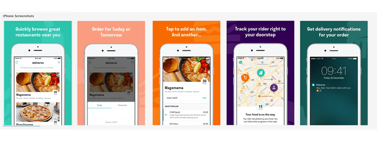
Think about Deliveroo’s App Store screens. Isn’t this what you’ve always wanted from a food delivery app? They’re spot on in presenting the benefits of the app.
Let’s say you’ve convinced someone to download your app, and they’re about to open it for the very first time. What will this experience entail?
This is where step 2 of outside-product user onboarding takes place.
You could use a few instruction elements (nice visuals and bits of copy) and action elements to get the user inside the app. Show the user the most compelling benefits of using your app in a few nicely designed screens, and encourage them every step of the way to try it out for themselves.
Another approach is to make it clear to users that sharing information about themselves will be rewarded in the long run. Use instruction elements to make your intentions clear, and action elements to point the user in the right direction.
If you’ve managed to spike the user’s interest and motivate them to give the app a chance, you can move on to the second major area of mobile user onboarding.
Inside-product onboarding
Once the user is inside your mobile app, they’ll expect to find everything they’ve been promised in the previous onboarding phase. You don’t want them to get lost, wondering what to do next. So, you have to show them where to go.
Instagram inside-product onboarding
Instagram does a great job explaining the benefits of allowing access to photos and microphone beforehand. Hook, jab – jab!
The focus of the onboarding process should be to guide the user towards the core value proposition of the app. Help them discover how your app can bring an improvement to the way they’ve been doing things up until now, or how much fun it is. Once this is done, the user will be a lot more open to discover the rest of the app’s features, one at a time.
Let’s take a look at a few examples of how you could guide the user through the core use case of your app.
- For a social app, people will expect to be able to contact a friend as soon as possible in order to decide if this product brings anything new to the table. Is the core feature of the product the ability to chat with friends and family, or is the user’s profile equally important? Show the users how to set up a profile with a minimum amount of information, how to add friends (offer the option to import contacts), and enable them to chat freely. Then cross your fingers.
- For a calendar app, it’s all about how well the product organizes the user’s schedule. Allow the user to either import or sync existing calendars and events from other platforms, if they want to. Quickly enable the user to get the feel of the product. What’s the design of this calendar? Is the schedule easy to analyze? What kind of customization is available for the different types of events?
- For a photo editing app, show the user how effortless the entire process is. Enable them to either pick an image from the camera roll or take a picture on the spot, then guide them through the editing process using annotations where necessary, and finally present them with the sharing options. For people working with picture editing apps, a fluent editing journey is as important as the quality of the product.
Conclusion – user onboarding as the foundation of your mobile product
A good mobile product deserves a solid user onboarding strategy. Don’t limit yourself to the product itself, but think of the people who will be using it, as well, and put yourself in their shoes. Start planning by taking a close look at your app’s core value—and make it obvious to your users every chance you get. Whether it’s an ad for the app or an onboarding screen, everything has to make a valuable statement about the product and its capabilities.
Got it? Now it’s your turn.


